Ya Basta Rebrand & Website Redesign
Overview
Ya Basta is a nonprofit organization confronting sexual brokenness through practical, emotional, and spiritual resources. Its work addresses difficult subjects—including sexual abuse, pornography, addiction, and shame—while helping people move toward dignity, healing, and lasting change.
The project expanded from a website redesign into a complete rebrand. We needed to create a system that felt courageous without becoming cold, hopeful without minimizing the subject, and contemporary enough to build a real sense of community—especially with younger audiences.
The final experience connects the brand and website around one shared purpose: helping visitors understand the problem, see a human response, find a meaningful way to participate, and feel confident taking the next step through volunteering, resources, or donation.
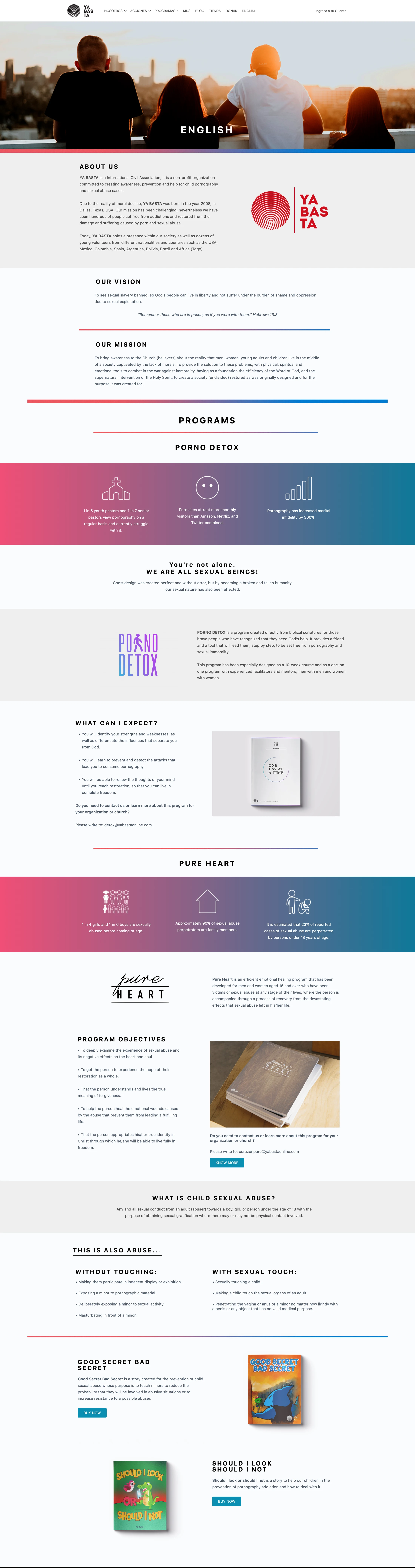
The Challenge: A Mission Without a Consistent System
The previous website felt muted and generic compared with the urgency and humanity of Ya Basta’s mission. It used colors without clear roles, mixed visual styles from section to section, and lacked a recognizable direction that could hold the experience together.
Long pages were dominated by text and program information, while the emotional connection depended on only a few images. Participation and donation—the actions most important to sustaining the community—did not feel like the natural culmination of the story.
The redesign needed to replace that fragmentation with a distinctive identity, a warmer emotional tone, and a clearer journey from awareness to action.
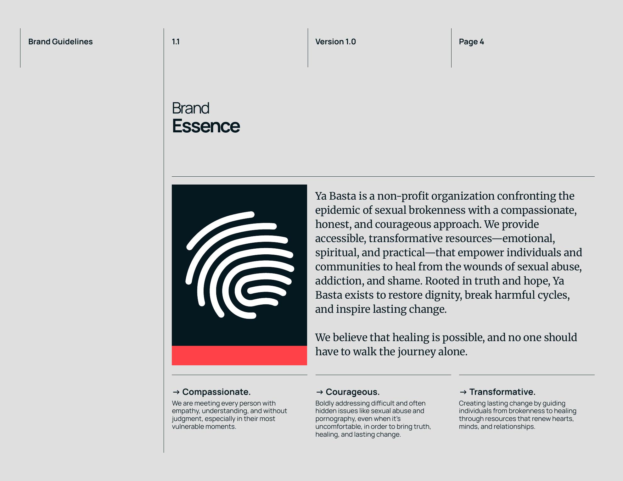
Defining a Human Brand Voice
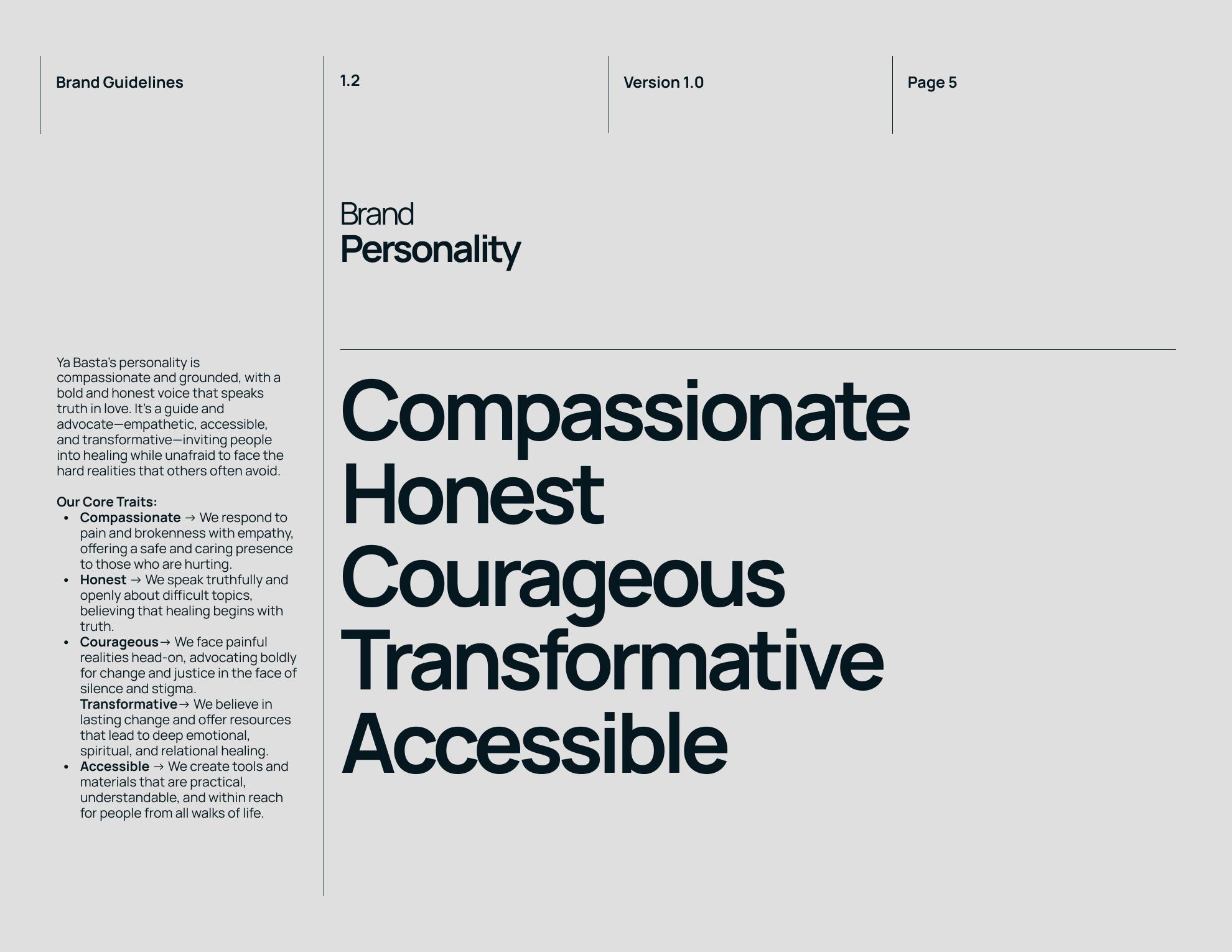
We defined the brand around five traits: compassionate, honest, courageous, transformative, and accessible. These principles helped us avoid two extremes—the distant tone of an institution and the overly serious visual language often associated with difficult nonprofit work.
The new direction speaks honestly about the problem while still feeling warm, inviting, and community-led. Helping others should feel meaningful and energizing, not formal or boring. That balance became especially important for connecting with younger people and inviting them to see participation as something hopeful and relevant.
An Identity Rooted in Dignity
The fingerprint became the central symbol of the identity. It represents the individuality and dignity of every person, while its open, repeated lines suggest recovery, movement, and transformation rather than a fixed label.
Paired with a clean, assertive wordmark and the line “Una voz de cambio,” the mark gives Ya Basta a recognizable voice that can move between advocacy, education, social content, and community programs without losing its meaning.
Warmth With Urgency
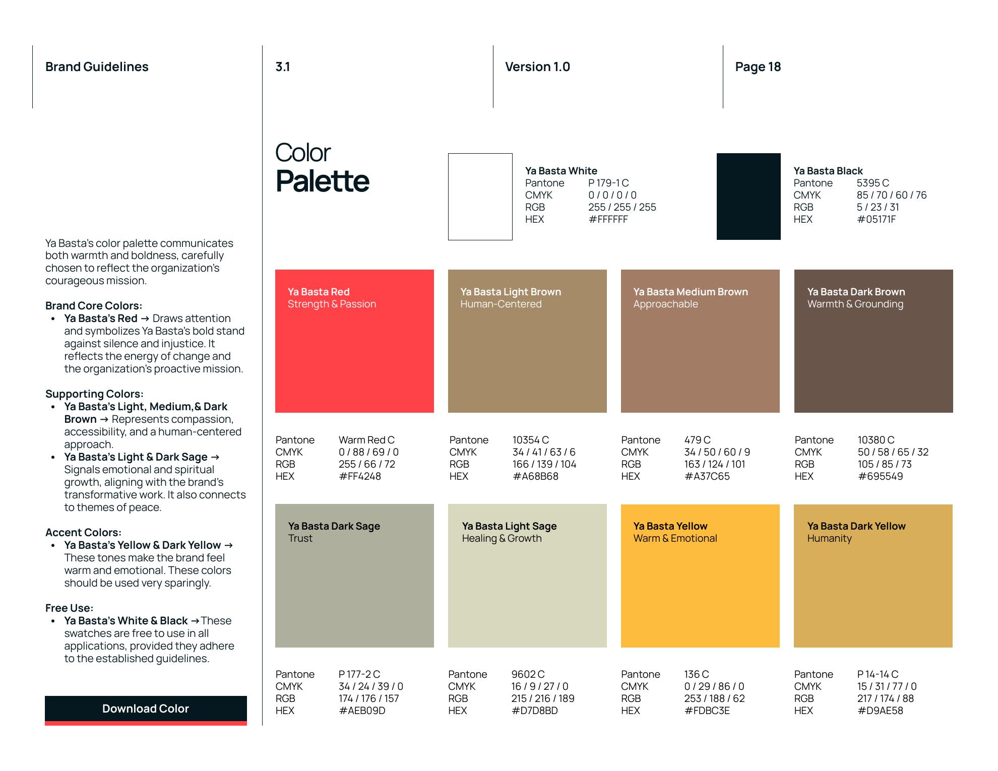
Instead of continuing with random color choices, we gave every part of the palette a clear emotional role. Ya Basta Red brings urgency, courage, and attention; warm browns make the system feel grounded and human; sage tones introduce healing, trust, and growth; and yellow is used sparingly for hope and emotional lift.
The palette can be bold when the message demands action, but it can also become quiet and supportive around sensitive stories. That range allows the identity to feel modern and memorable without treating every subject with the same intensity.
Balancing Strength and Care
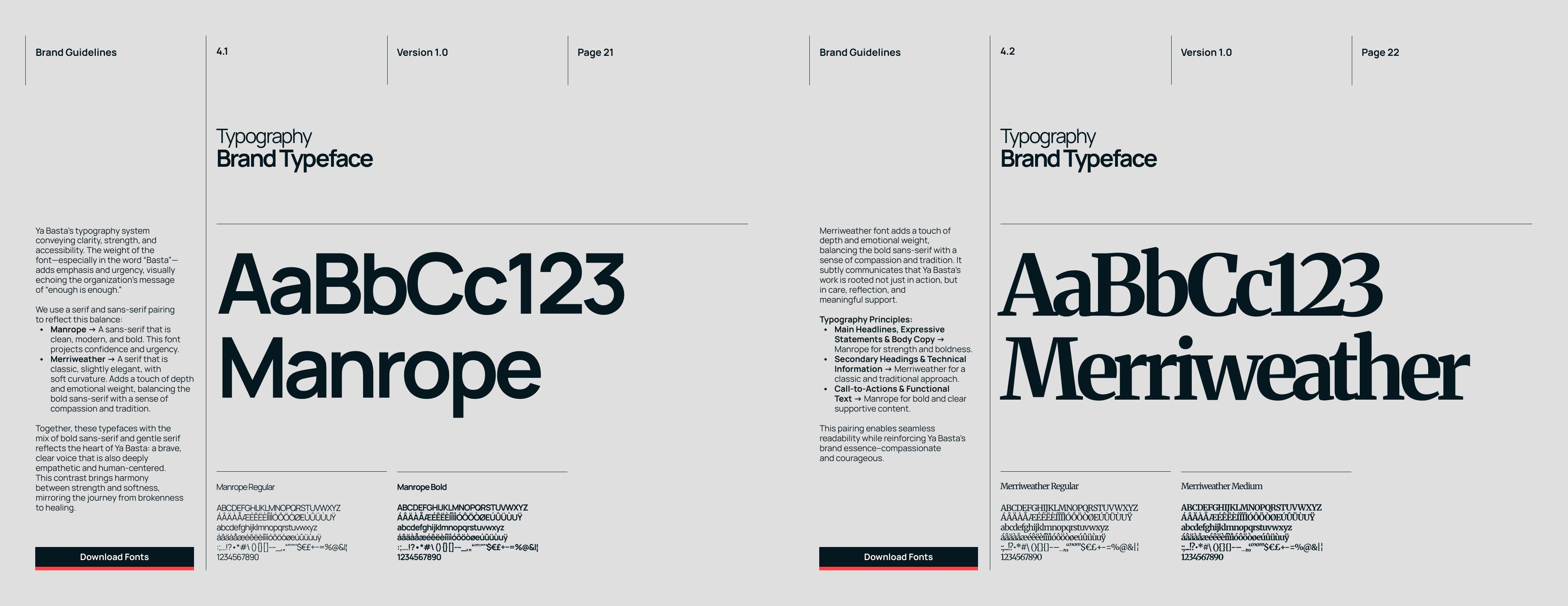
Typography carries the same duality. Manrope provides a direct, modern voice for major statements, navigation, and calls to action. Merriweather adds reflection and emotional depth to supporting messages where a softer, more human tone is needed.
Together they make the brand feel bold without becoming harsh. The contrast gives urgent messages clarity while preserving the compassion and care at the heart of the organization.
Making Human Connection Visible
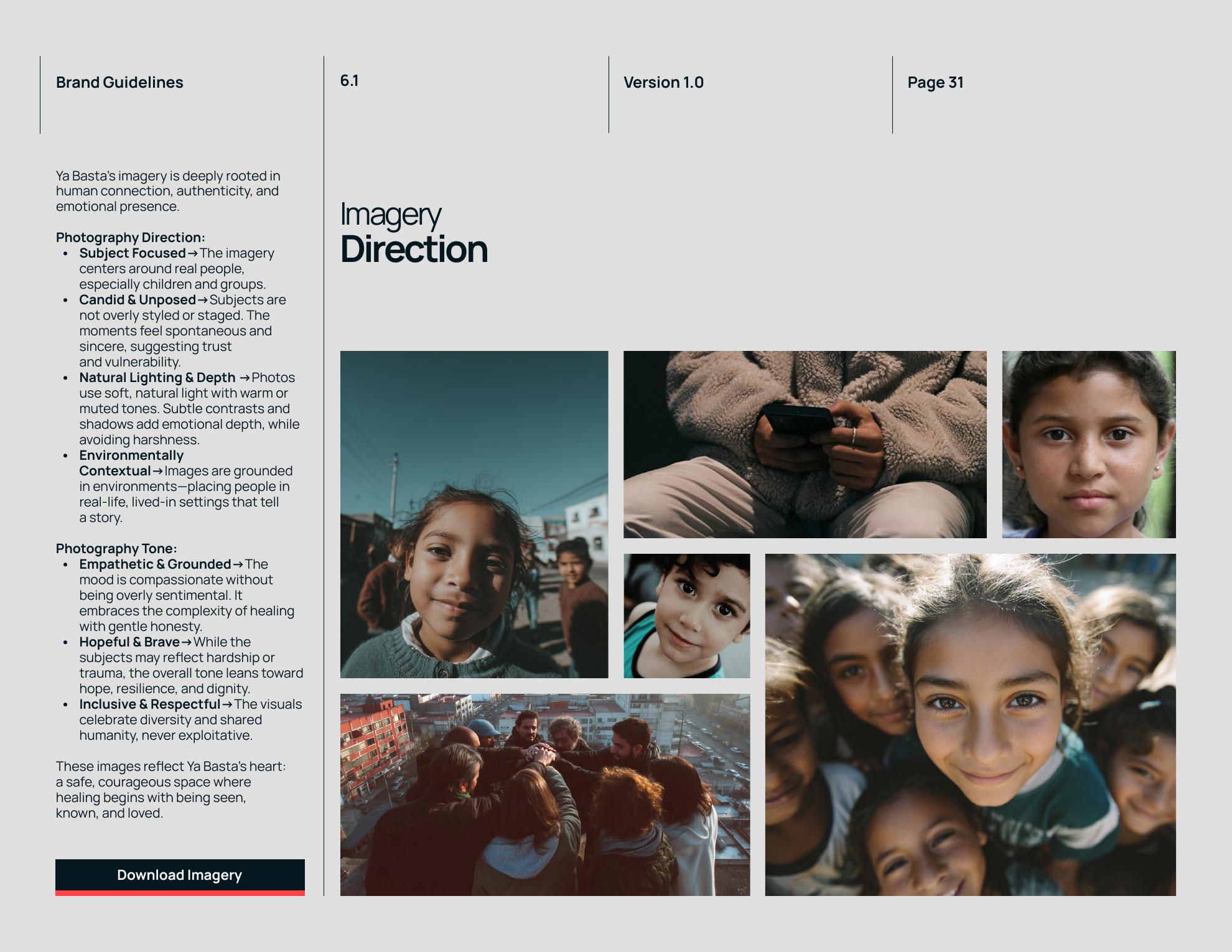
Photography became essential to building an emotional connection. The direction centers real people, candid moments, natural light, and environments that feel lived in rather than staged.
The imagery acknowledges hardship without exploiting it. Expressions of vulnerability are balanced with dignity, hope, resilience, and community—helping visitors see the people behind the mission and understand that healing does not happen alone.
Modern Enough to Invite a New Generation
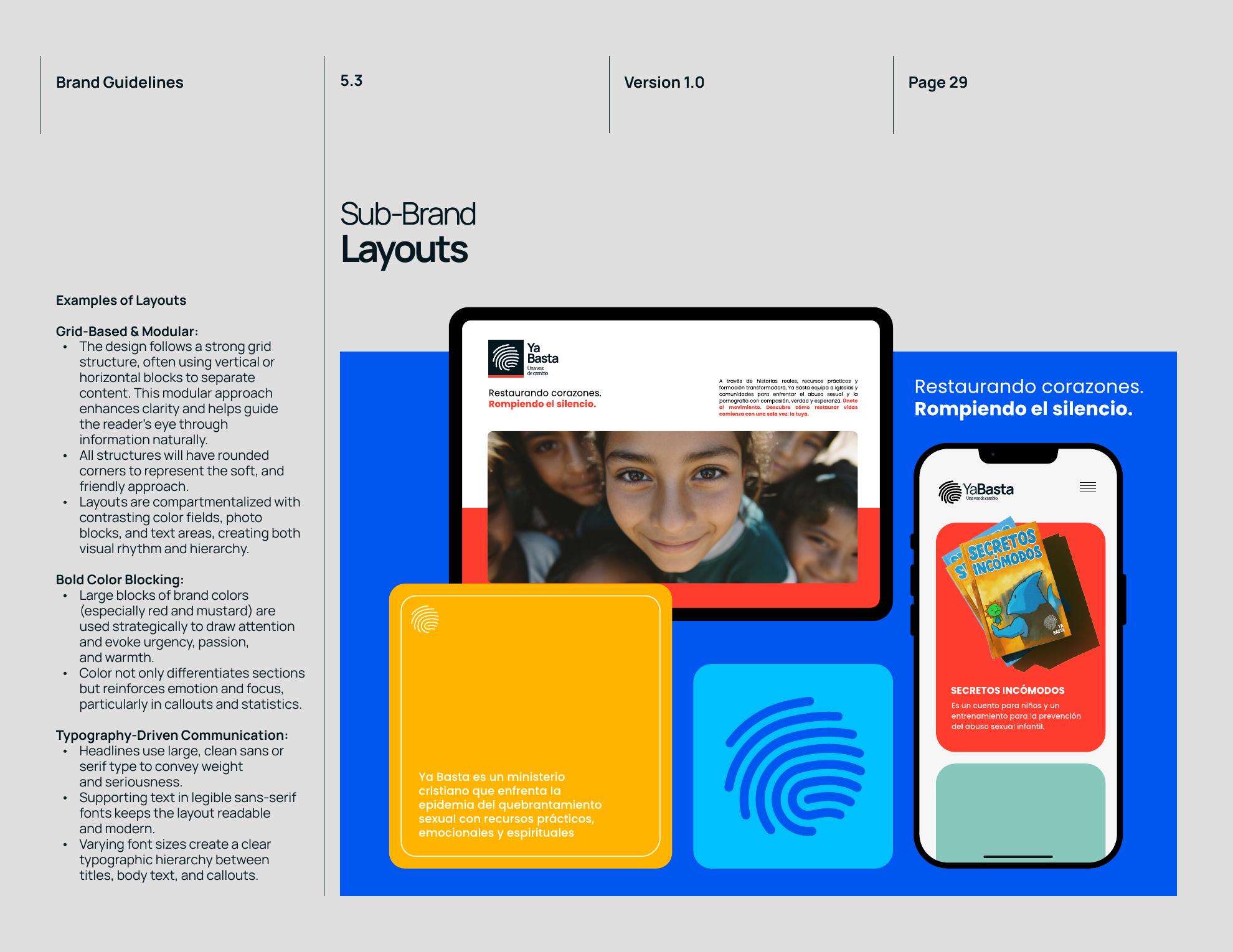
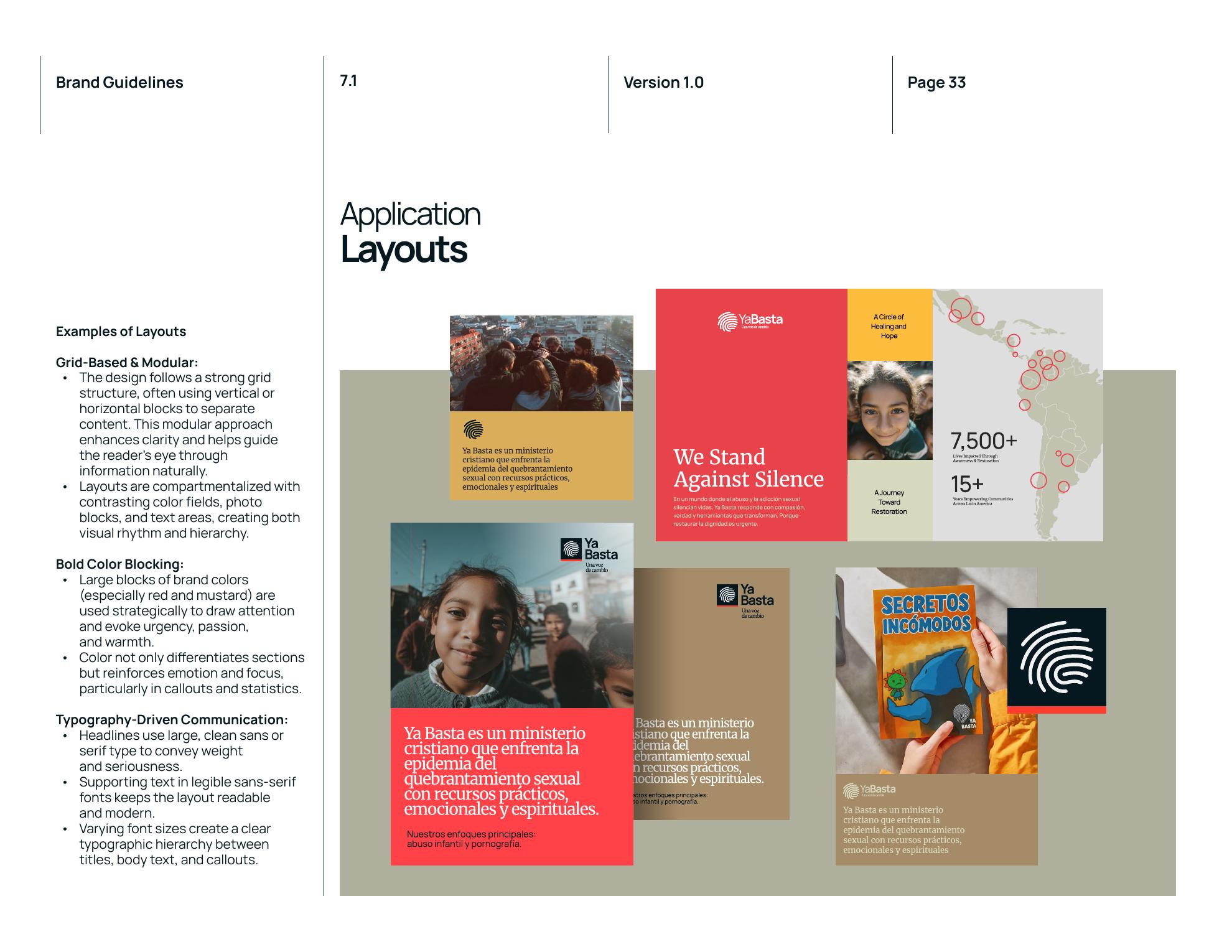
To connect with younger audiences, the system needed energy and cultural relevance without feeling childish or trend-driven. We used modular grids, rounded containers, bold color fields, large typography, and expressive image crops to create a visual rhythm that feels current and easy to explore.
The brighter youth palette and flexible layouts allow educational resources and community programs to feel approachable. The work still treats the subject with care, but participation now feels active, social, and genuinely inviting.
A System Built Beyond One Page
The identity was designed as a repeatable toolkit rather than a single campaign. Grid rules, color roles, typography hierarchy, image treatments, and content modules can scale across social posts, presentations, educational resources, fundraising materials, and future digital experiences.
That consistency gives Ya Basta a stronger presence while making day-to-day creation easier for the team. New communications can feel fresh and expressive without returning to the visual fragmentation of the previous brand.
A Homepage Built as a Story
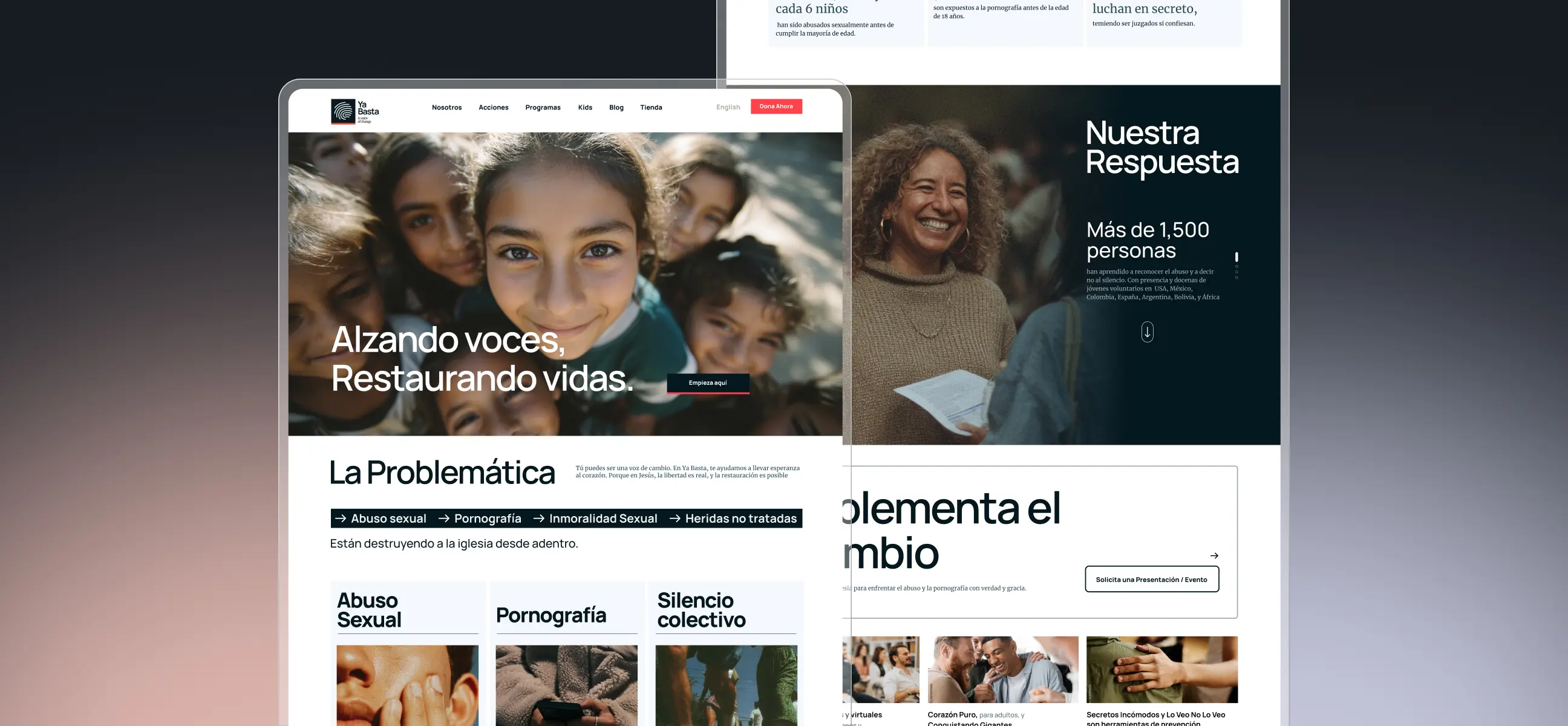
The redesigned homepage begins with people rather than programs. A direct statement—“Alzando voces, restaurando vidas”—creates an immediate emotional entry point, then introduces the scale of the problem through a concise set of topics and statistics.
From there, the page moves into Ya Basta’s response and impact. This progression helps visitors understand why the work matters before asking them to explore services or take action.

From Awareness to Participation
The middle of the homepage turns a difficult topic into a clear set of ways to engage. Program cards, community imagery, impact stories, and the “Implementa el Cambio” section break the mission into understandable actions without oversimplifying it.
Each module gives visitors enough context to choose their own path—learn, invite a presentation, access resources, support a program, or become part of the community. The structure keeps the experience informative while preventing it from feeling like a wall of institutional content.
Making the Next Step Feel Natural
Donation was an important conversion goal, but it needed to feel earned rather than inserted. The homepage first builds understanding and trust, then introduces clear ways to help for donors, leaders, and the broader community.
Educational content and stories continue supporting that decision before the final “Únete y Dona” message. By the time visitors reach the call to action, giving feels like a continuation of the narrative—not an interruption to it.
The Result
The final rebrand gives Ya Basta a cohesive, recognizable presence that can carry a difficult mission with both courage and humanity. The organization now feels modern, warm, and community-driven—serious about the problem without making participation feel distant or discouraging.
The website transforms that identity into a guided experience. Strong imagery creates connection, the content hierarchy makes the mission easier to understand, and the journey gives awareness, programs, community, and donation a clear role within one story.