Money's Home Page
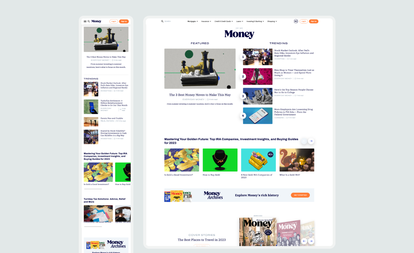
The Context
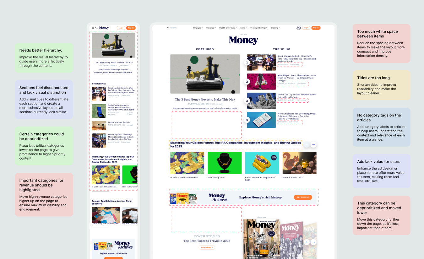
The main objective was to reimagine the homepage to create a more modern, engaging experience that would drive increased traffic. I quickly noticed that certain content was occupying excessive space, leading to inefficient use of the landing page area, with wasted space and visually disconnected sections. Additionally, ads appeared out of place, and other content took up unnecessary vertical space, requiring excessive scrolling from users.
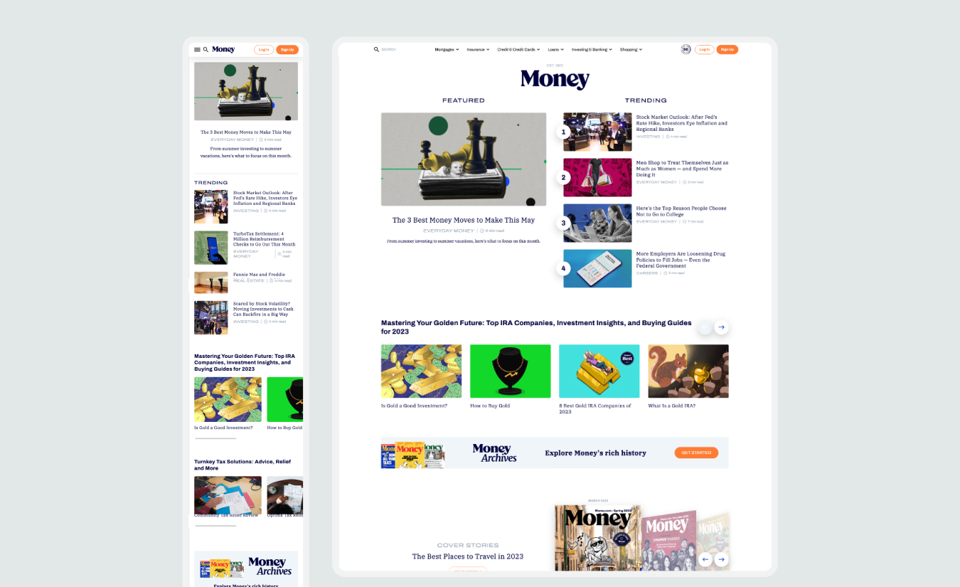
The Problem
The Money landing page was starting to look outdated and was lagging behind competitors in terms of visual appeal and engagement, leading to noticeable drops in traffic and interaction. Key competitors, including Forbes and U.S. News, had more modern and effective designs. One of the primary challenges was the extensive use of pre-designed widgets on the page, which limited our flexibility. Any major changes risked impacting their performance, so we needed to carefully integrate these elements into a refreshed design that felt cohesive and modern.
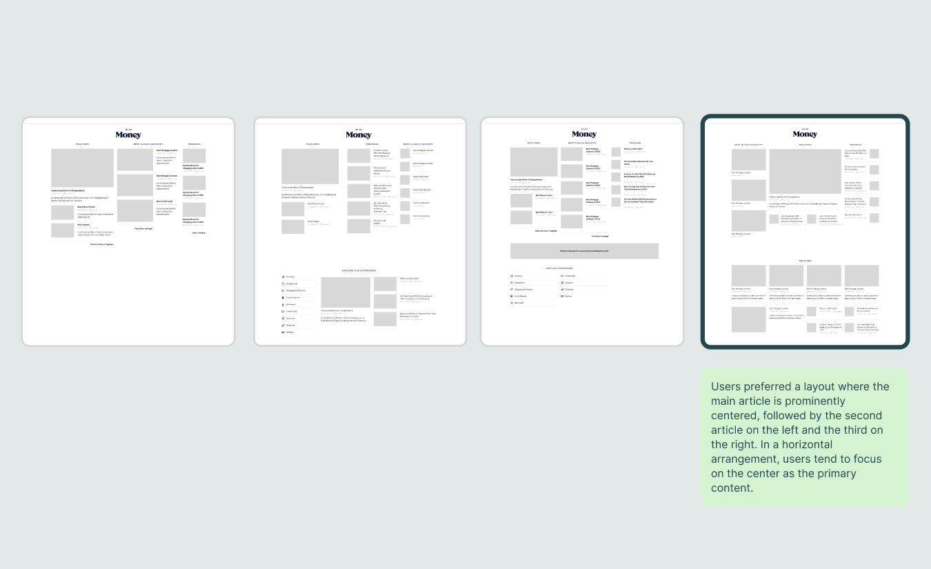
Layout Testing
We started by experimenting with different layouts to find the one that performed best and used space more efficiently. A key challenge was making sure the main article didn’t get overshadowed by the secondary and third articles—we wanted it to stand out as the main focus.
The Objective
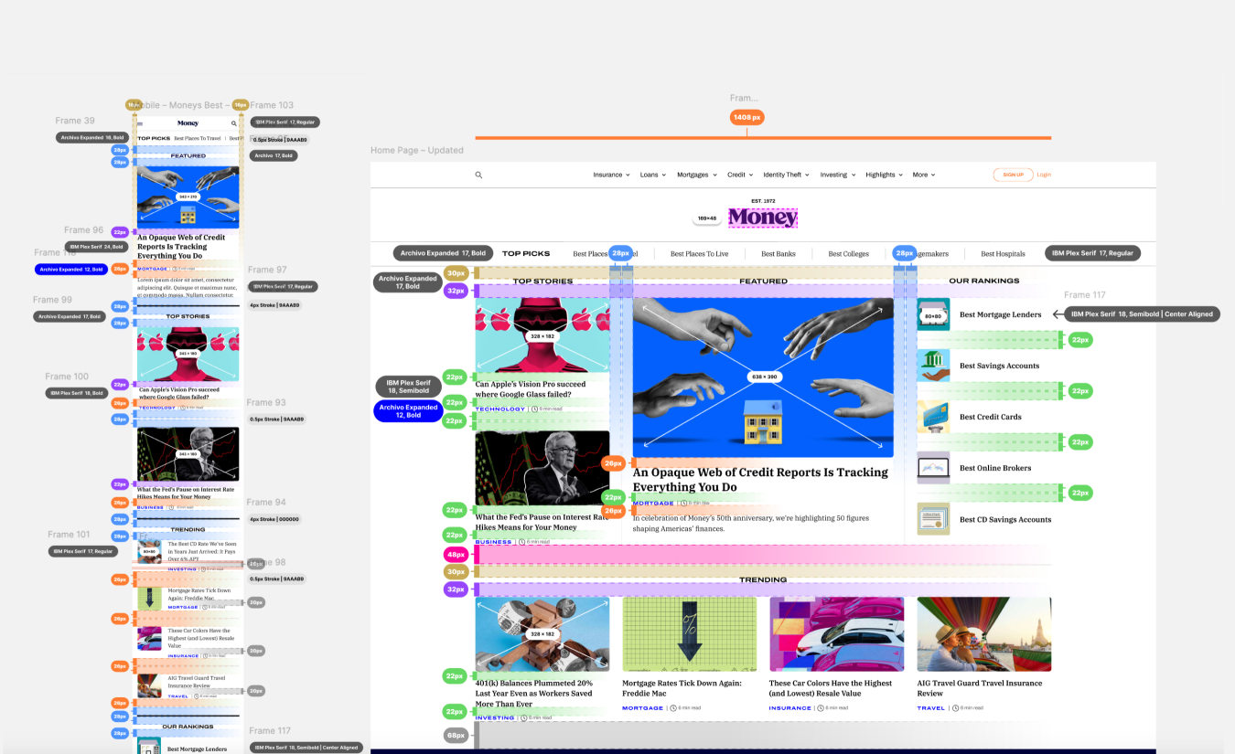
The main goal was to modernize the design, optimize the layout to make better use of white space, and introduce new features to enhance the user experience. We added elements like a “Top Picks” slider at the top for easy access, more visible category links on each article, and a full category section where users can view all articles related to a specific topic.
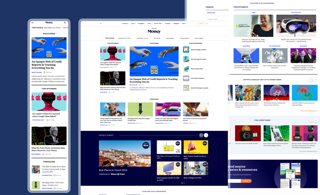
Prototype
I created an interactive prototype to test with users and get a better feel for the new layout and features. It was a great way to visualize the final product and gather feedback, helping us refine the design before moving forward.
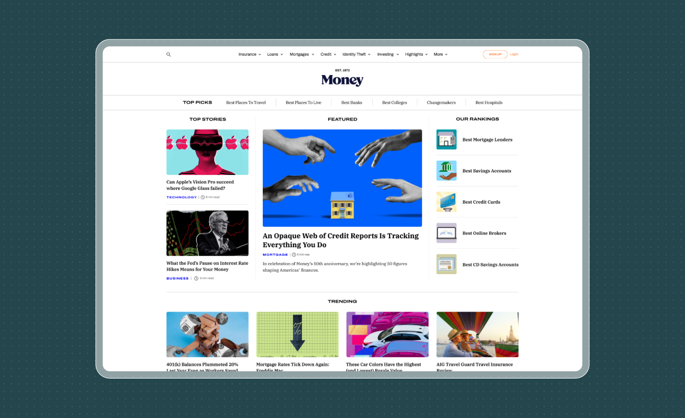
QA
Once the final design was approved, it was crucial to ensure everything looked and functioned exactly as intended. With my coding skills and front-end experience, I could effectively translate the design into detailed visual specs. My understanding of how developers think gave me a unique advantage in bridging the gap between design and implementation.