Citi Wealth Mobile App
The Context
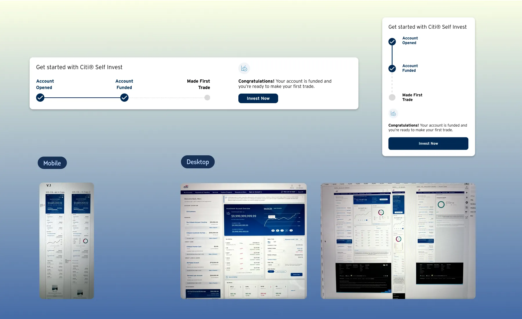
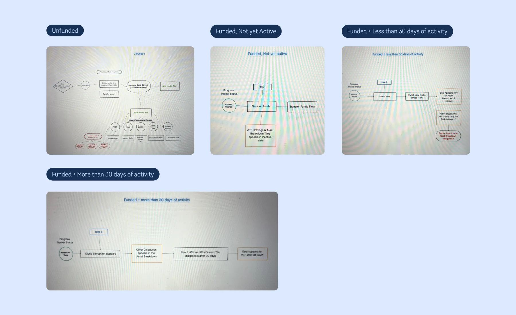
The “What’s Next” introduces a tile-based design that guides users through the steps after creating their first investment account. Each tile outlines actionable steps, helping users understand what to do next and track their progress. This feature provides a visual roadmap, allowing users to see completed steps and what lies ahead, giving them a clear picture of their journey and boosting confidence as they navigate their new investment account.
Our goal was to create a smooth onboarding flow for customers opening a new “Citi Self Invest Account,” guiding them from setup through to active usage. This experience needed to be responsive on both web and mobile. For the web version, we expanded the scope to cover all investment accounts, rather than focusing only on Citi Self Invest.
The Problem
The tile operates independently but should interact with other tiles to share relevant information. Each tile must display some information at all times. However, since the current tile framework isn’t dynamic enough to show or hide tiles as needed, we had to design empty states. The challenge was to create the impression of active content, even when data wasn’t yet available, as it takes several days after account creation for investment data to start populating.
Single Citi Self Invest Account — Mapping
Low-Fi Concepts
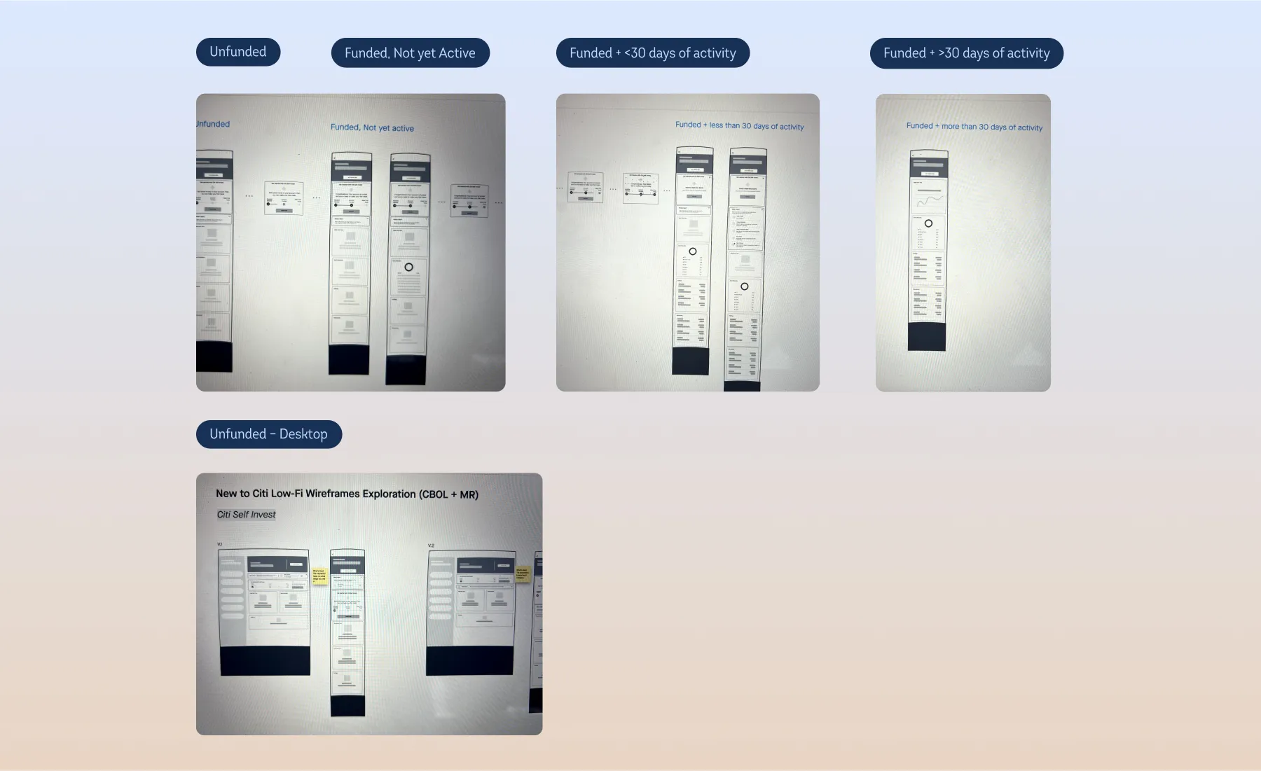
Once the mapping was done, we started sketching low-fidelity screens to get a sense of how the flow would come together. There was a lot of back and forth until we landed on a clear and intuitive path. It was essential to make sure users always knew where they were in the process and got visual confirmation for every action they took.
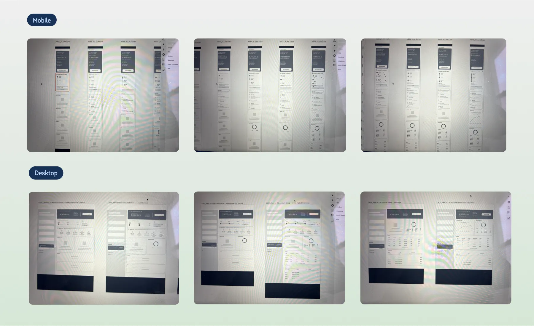
Final Design
User Testing
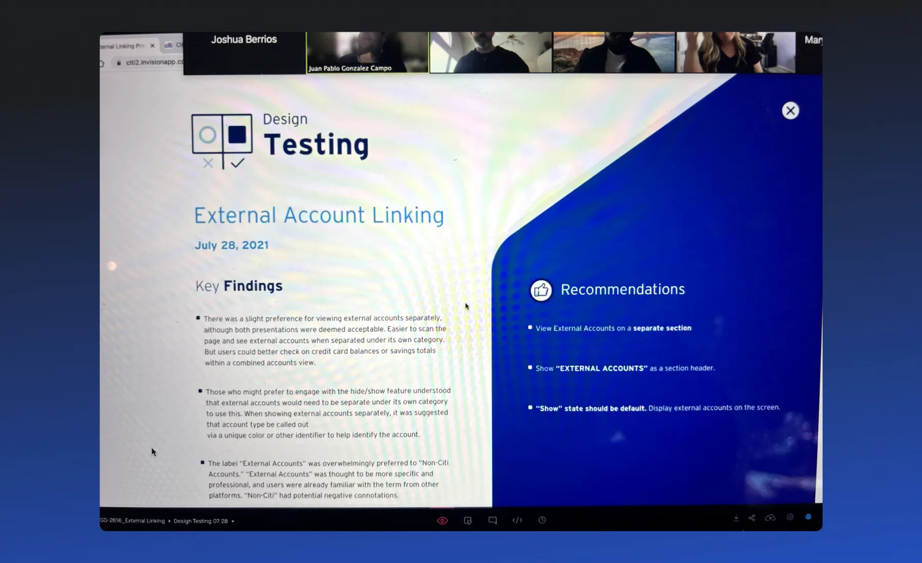
We worked with a third-party research company to conduct sessions with real users. These sessions could take hours, sometimes even a full day, so it was important to make sure the moderator was fully prepared. They needed a clear understanding of the user journey and the key questions to ask. We also took care to recruit the right demographic, focusing on people with investment accounts—both Citi members and non-members.
After gathering all the findings from the initial sessions, we used the insights to create a second version of the design, incorporating the feedback and addressing any pain points. We then conducted another round of user testing to validate the improvements and ensure the updates met user needs effectively.