Stateside Website
A New Store Needed a Digital Home
Stateside was a concept for a new sleep and mattress retailer preparing to enter the market. Because the store did not yet have an established digital experience, the website needed to introduce the brand, build confidence, explain the products, and create a clear path from inspiration to purchase.
The client wanted the experience to express three qualities at every touchpoint: luxury, comfort, and reliability. The challenge was to make the site feel premium without becoming distant, and soft without losing the clarity expected from an e-commerce experience.
Learning to Design Complete Websites
I worked on Stateside while part of The Old State, a small design studio in Dallas, Texas. This chapter of my career was where I began designing complete websites rather than isolated pages—thinking through how a visual idea needed to extend across navigation, content, product discovery, commerce, and supporting brand pages.
Working in a small studio meant staying close to the entire experience. Each page needed to feel distinct enough to serve its purpose while still belonging to one cohesive system. Stateside became an early opportunity to practice that end-to-end way of thinking.
Defining the Experience
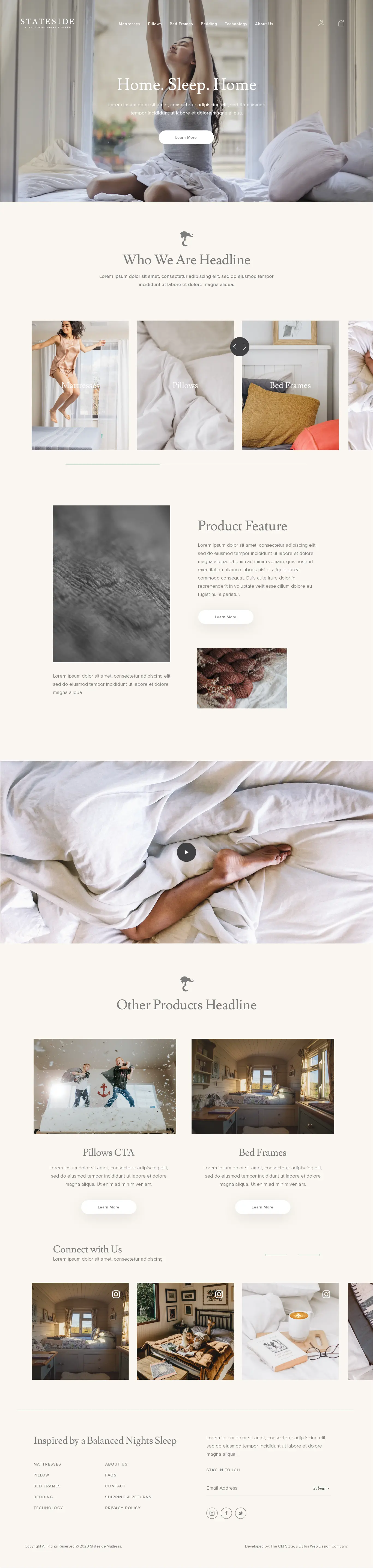
The visual direction used a warm neutral foundation, generous negative space, soft lifestyle photography, restrained mint accents, and elegant editorial typography. Together, those elements gave the brand a quiet sense of luxury while keeping the experience welcoming and easy to navigate.
- Luxury through spacious layouts, refined typography, and intentional pacing.
- Comfort through soft color, tactile imagery, and calm visual transitions.
- Reliability through clear navigation, structured product details, reviews, policies, and supporting information.
The Home Page
The home page introduced Stateside as more than a mattress store. It opened with an emotional sleep-focused message, then moved into product categories, material details, lifestyle storytelling, supporting products, and social proof. The goal was to let visitors feel the brand before asking them to shop.
Long sections and quiet transitions created a slower, more considered rhythm that matched the idea of rest, while repeated product entry points ensured the page still supported discovery and conversion.
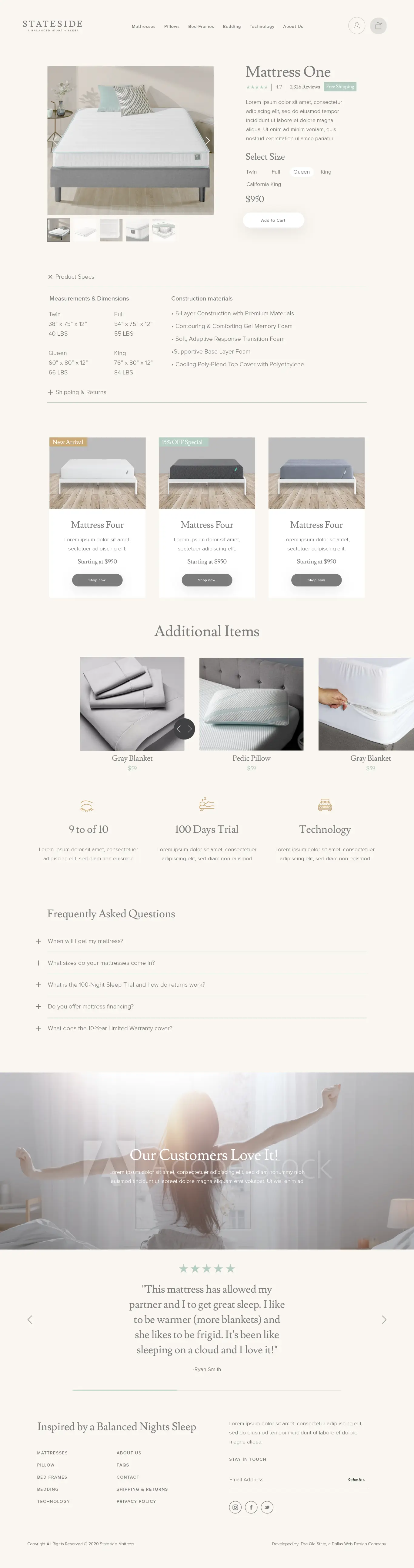
Making Product Information Feel Premium
The product-detail experience balanced a calm visual presentation with the practical information someone needs before making a high-consideration purchase. Product imagery, reviews, size selection, pricing, specifications, materials, shipping information, related products, trial messaging, and FAQs were organized into one continuous decision journey.
Instead of treating those details as dense technical content, the layout used spacing and hierarchy to keep the page feeling light. The result protected the premium visual direction while giving shoppers enough information to feel confident about the purchase.
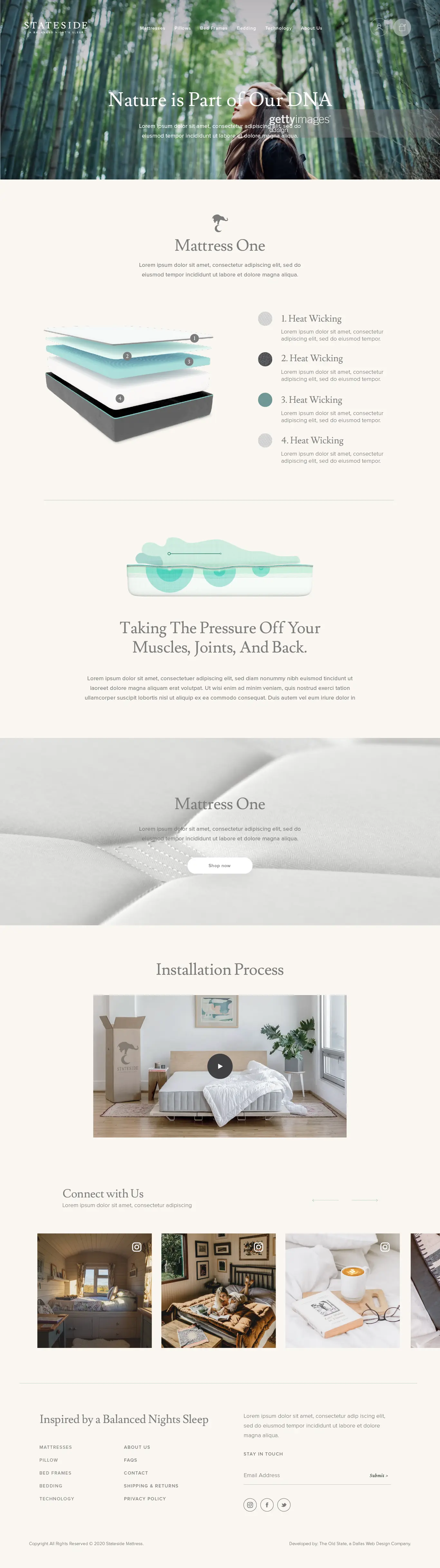
Explaining the Technology
A dedicated technology page translated the construction of the mattress into a visual story. Layer diagrams, pressure-relief illustrations, material explanations, and installation content helped make an unfamiliar product feel understandable and credible.
This page was especially important for reliability. It gave the brand space to explain why the product worked, not only how it looked, while keeping the technical story consistent with the softness and restraint of the broader experience.
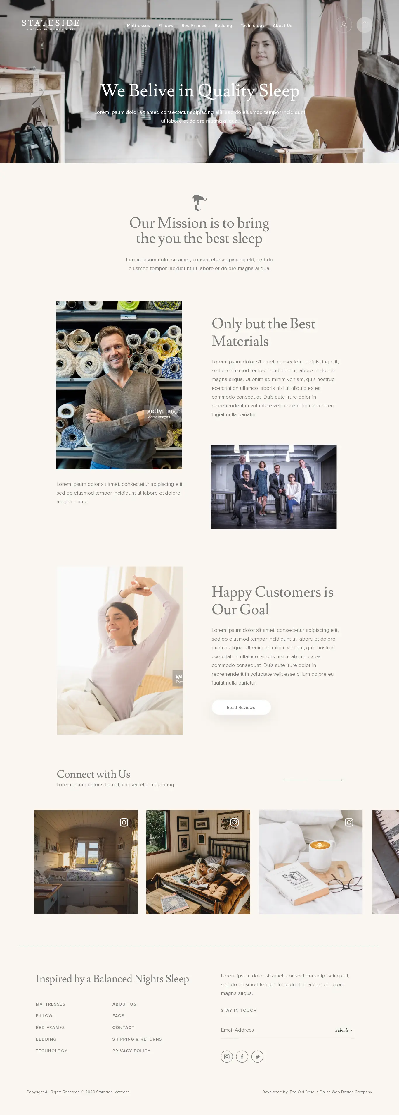
Building Trust Through Story
The About page connected the product to the people and values behind it. The narrative moved from the brand mission into quality materials, the team, customer happiness, and community content, giving visitors a more human reason to trust a new retailer.
The same design language carried across the page—soft neutrals, editorial headlines, carefully paced imagery, and understated interactions—so the brand story felt like a natural extension of the shopping experience.
The Approved Direction
The client approved the proposed website direction and responded strongly to how clearly it reflected the Stateside brand. The final system brought luxury, comfort, and reliability together across the entire experience rather than limiting those qualities to a single landing page.
For me, Stateside marked an important step in learning how to design full websites: not just a beautiful hero or an individual screen, but a connected system that could carry one brand idea through storytelling, education, product evaluation, and commerce.