Velo Rebrand & Website Redesign
Overview
Velo is a managed IT services company that helps businesses maintain, secure, and scale their technology infrastructure. Its work spans IT support, infrastructure management, cybersecurity, hardware solutions, and strategic consulting—valuable services that are often difficult to make visible.
The project expanded beyond a website refresh into a complete rebrand. We created a more distinctive identity, a flexible visual language, and a digital experience that could communicate technical expertise without feeling cold or overly complex.
The Branding Challenge
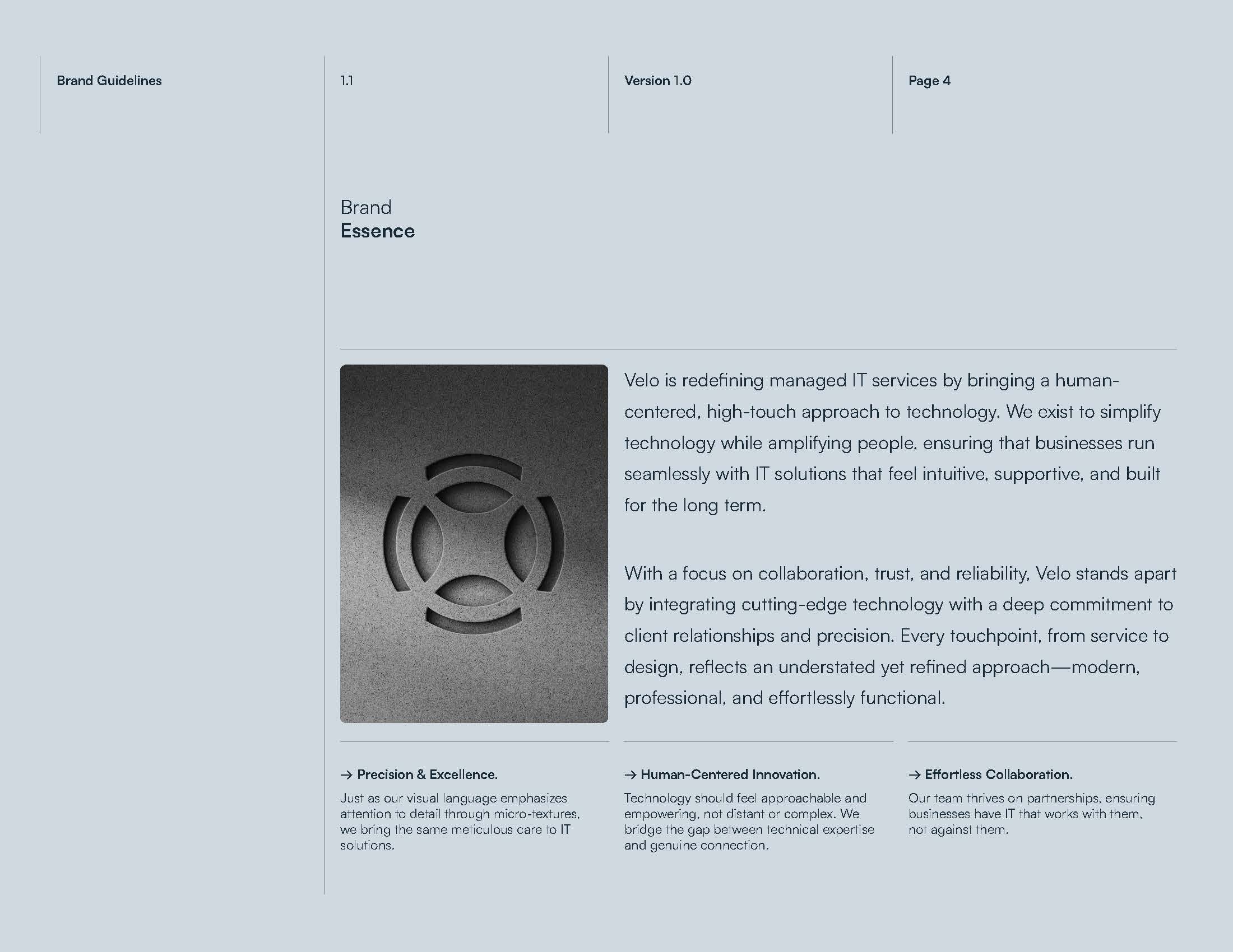
Velo’s previous identity felt muted and did not carry enough personality to represent the company it had become. The brand needed to feel more contemporary and memorable while preserving the sophistication, trust, and technical credibility expected from an IT partner.
The website reflected the same problem. It relied heavily on text, lacked a consistent visual system, and offered few ways to make abstract services feel concrete. Our challenge was to move the brand forward without making it feel loud, trendy, or disconnected from the precision of the business.
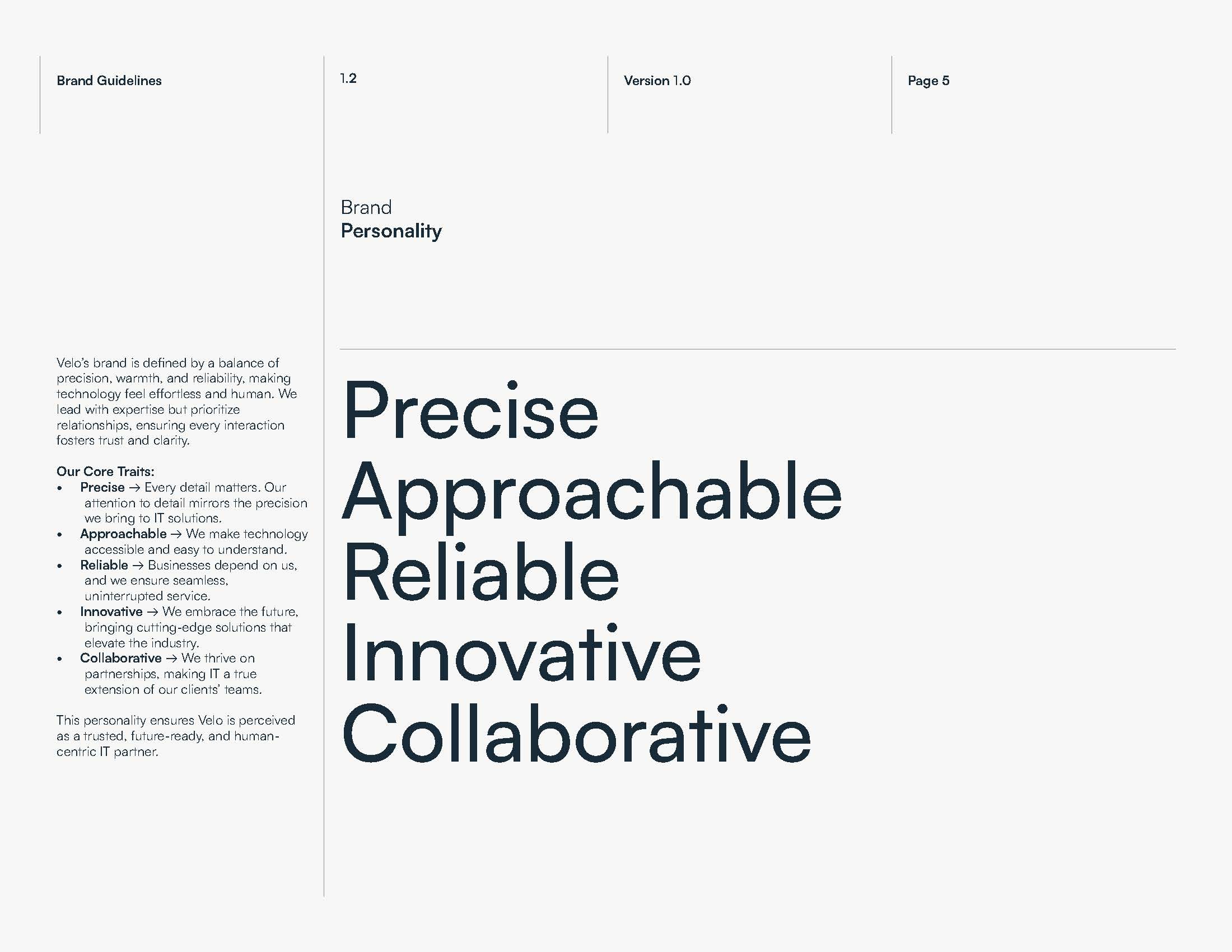
We defined the desired personality as precise, approachable, reliable, innovative, and collaborative. Those traits became the filter for every decision—from the logo and palette to the image direction and website hierarchy.
Working as One Design Team
A key part of the process was partnering closely with Velo’s internal design team. Because both teams were contributing to the final system, communication and alignment were just as important as the visual work itself.
We invested early in asking the right questions: how Velo wanted clients to feel, which qualities needed to remain recognizable, where the existing system was limiting the team, and how the identity would need to scale. That shared foundation reduced unnecessary back-and-forth and made reviews more focused.
The collaboration resulted in a system that felt owned by both teams. Decisions could move quickly because everyone was solving for the same brand principles instead of reacting to isolated screens or stylistic preferences.
A More Distinctive Mark
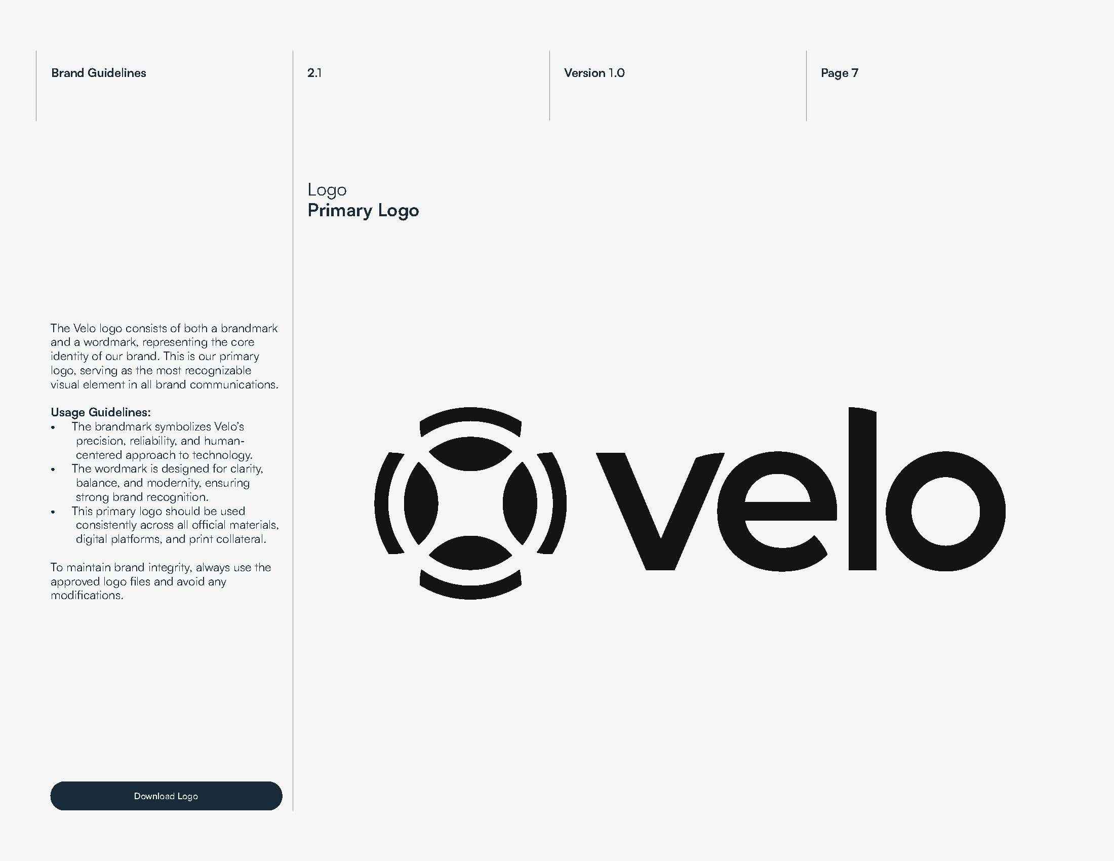
The new logo combines a modern wordmark with a precise circular symbol. The repeated arcs suggest connection, support, and coordinated systems—ideas that reflect how Velo brings people, infrastructure, and technology together.
Its geometry gives the identity a clear technological character, while the open negative space keeps it approachable. The symbol can work independently in compact digital environments, giving Velo a recognizable asset for social profiles, icons, merchandise, and interface details.
From Muted to Expressive
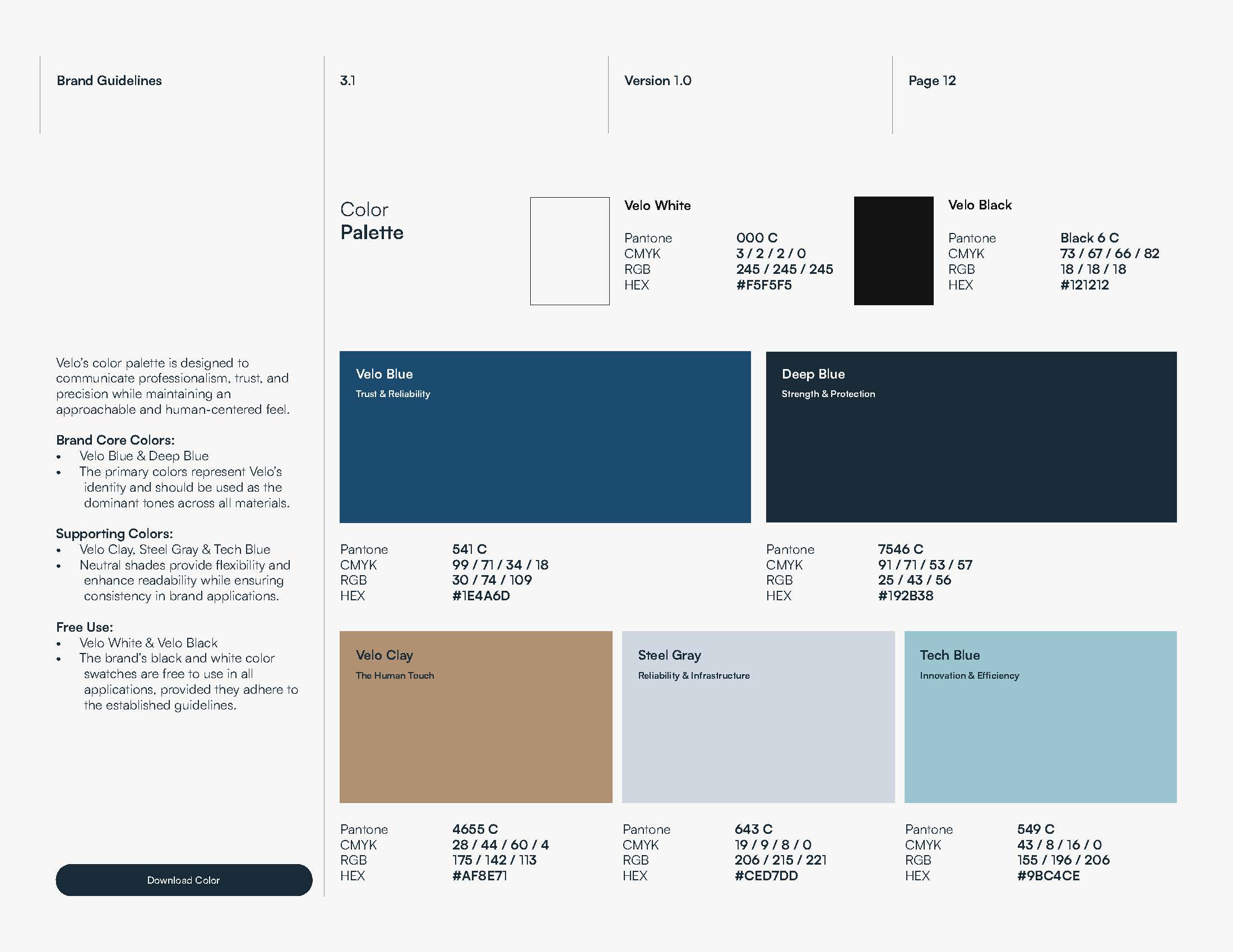
Color was one of the most important shifts away from the previous muted identity. Deep blue anchors the system in trust and protection, while Velo Blue and Tech Blue introduce more energy and personality. Steel gray and clay add flexibility, infrastructure cues, and a warmer human note.
The palette is more noticeable without feeling overly saturated. It gives the brand a stronger visual signature while maintaining the controlled, sophisticated tone Velo needed as a technology company.
Sophisticated, Technical & Human
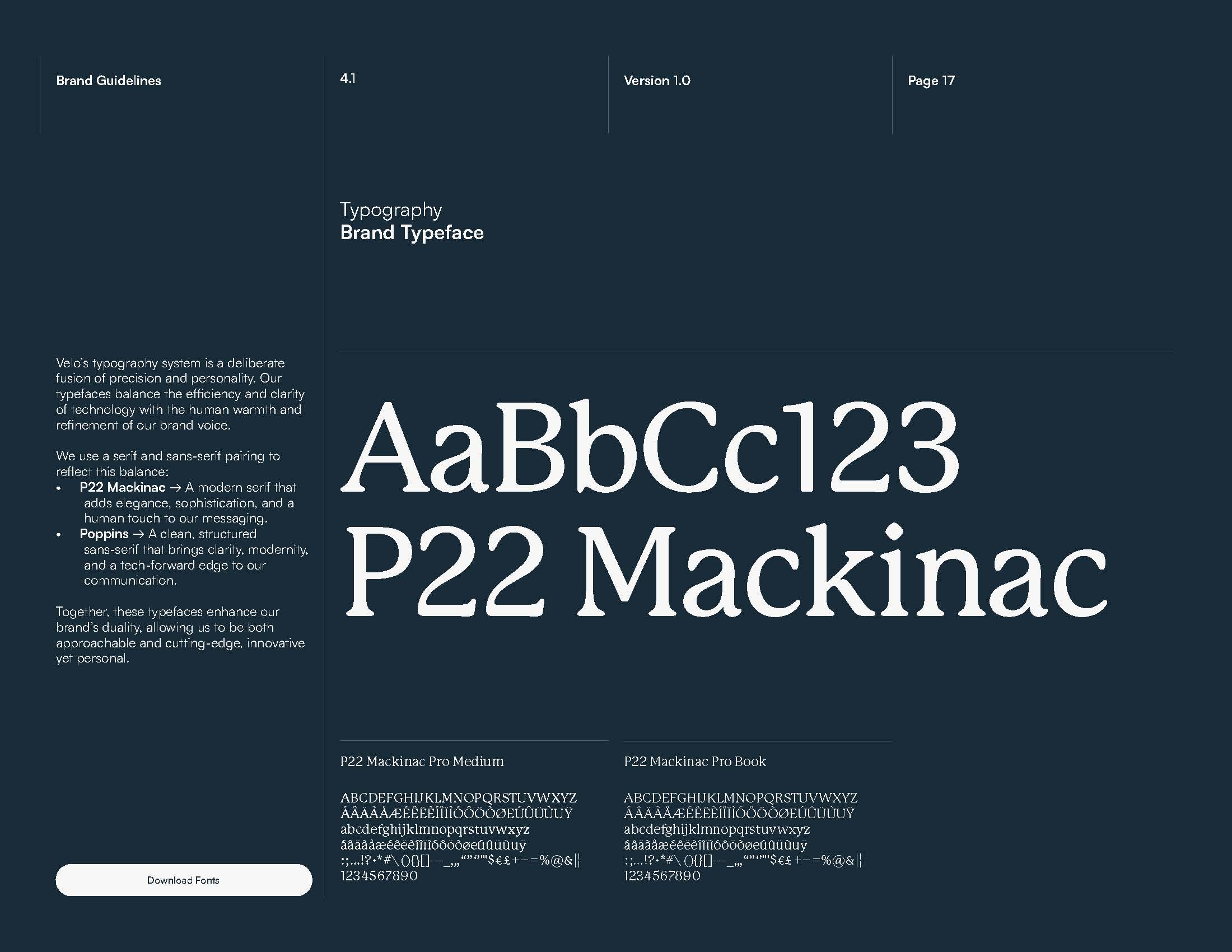
The typography system balances two sides of the brand. P22 Mackinac introduces elegance, warmth, and an editorial quality to important statements, while Poppins provides the clarity and structure needed for navigation, technical information, and interface elements.
Together, the typefaces prevent the brand from becoming another generic technology identity. The serif brings personality and sophistication; the sans serif keeps the system functional, modern, and easy to use across formats.
Making Invisible Services Visible
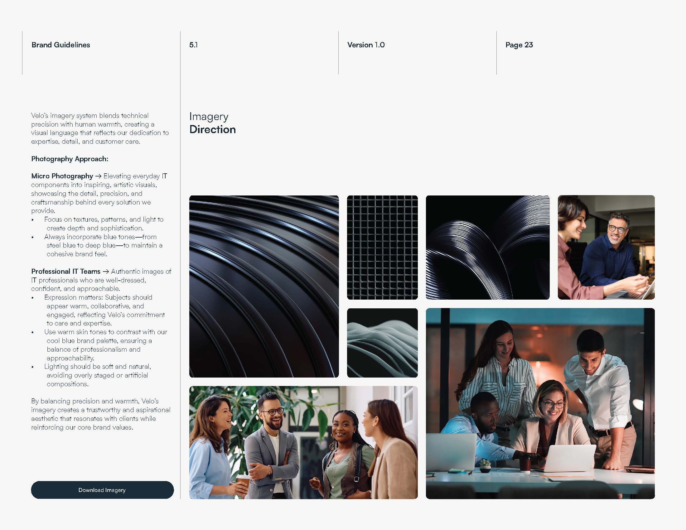
Managed IT is abstract by nature: clients experience the outcome, but much of the work happens behind the scenes. We needed an image language that could give that invisible expertise a physical presence.
The direction combines authentic, collaborative team photography with detailed micro-photography inspired by cables, infrastructure, light, and precision-engineered materials. Human moments make the company feel approachable, while the technical imagery communicates care, performance, and depth.
Texture, Waves & a Flexible Visual Language
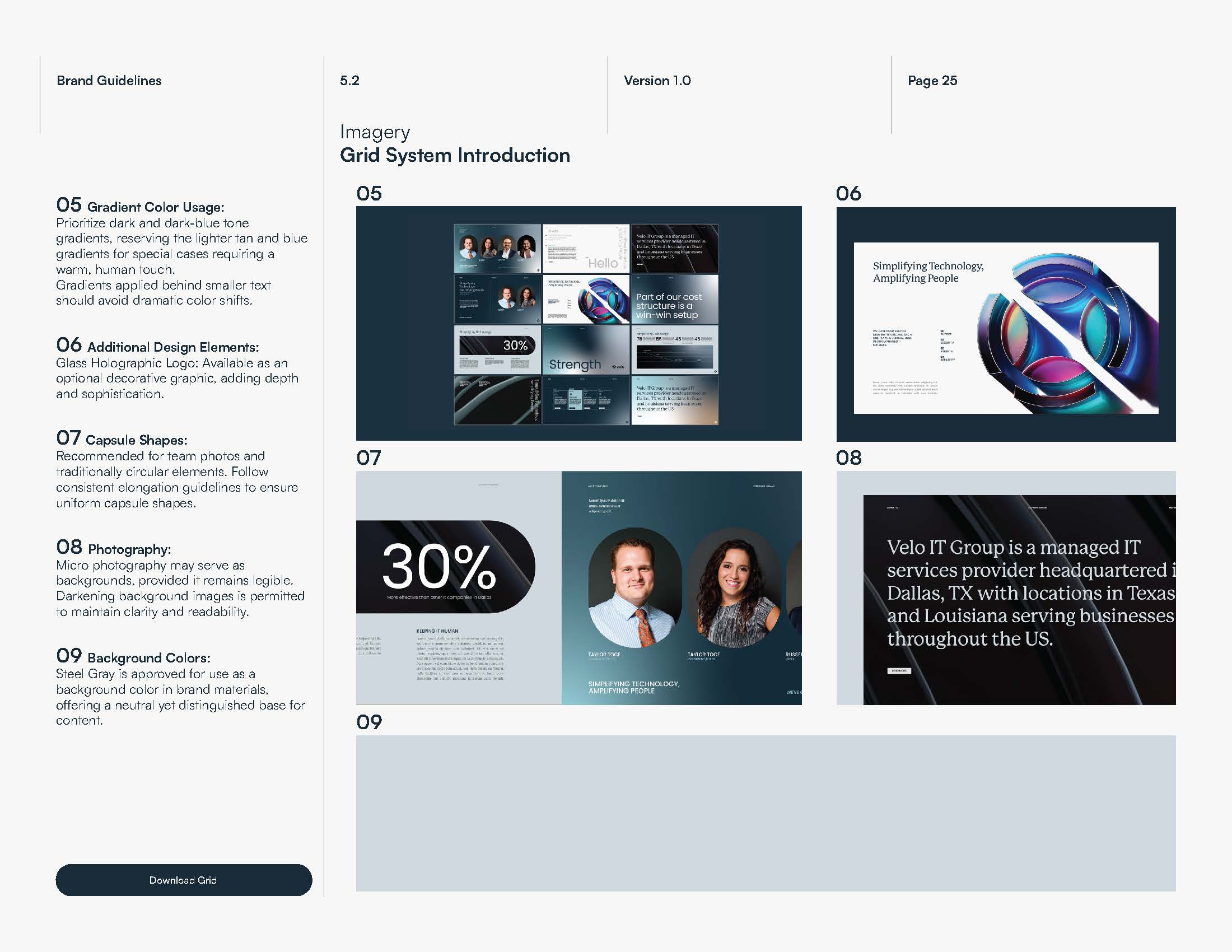
To give the system more personality, we developed textures, gradients, wave-like forms, and dimensional interpretations of the brandmark. The waves reference connectivity and continuous movement, making technical infrastructure feel more visual and dynamic without relying on literal technology clichés.
Organic gradients soften the system and create depth, while the underlying grid keeps compositions precise. Capsule shapes, microtextures, and the holographic mark extend the identity into presentations, campaigns, and digital experiences with enough variety to stay expressive without losing consistency.
A System Built to Scale
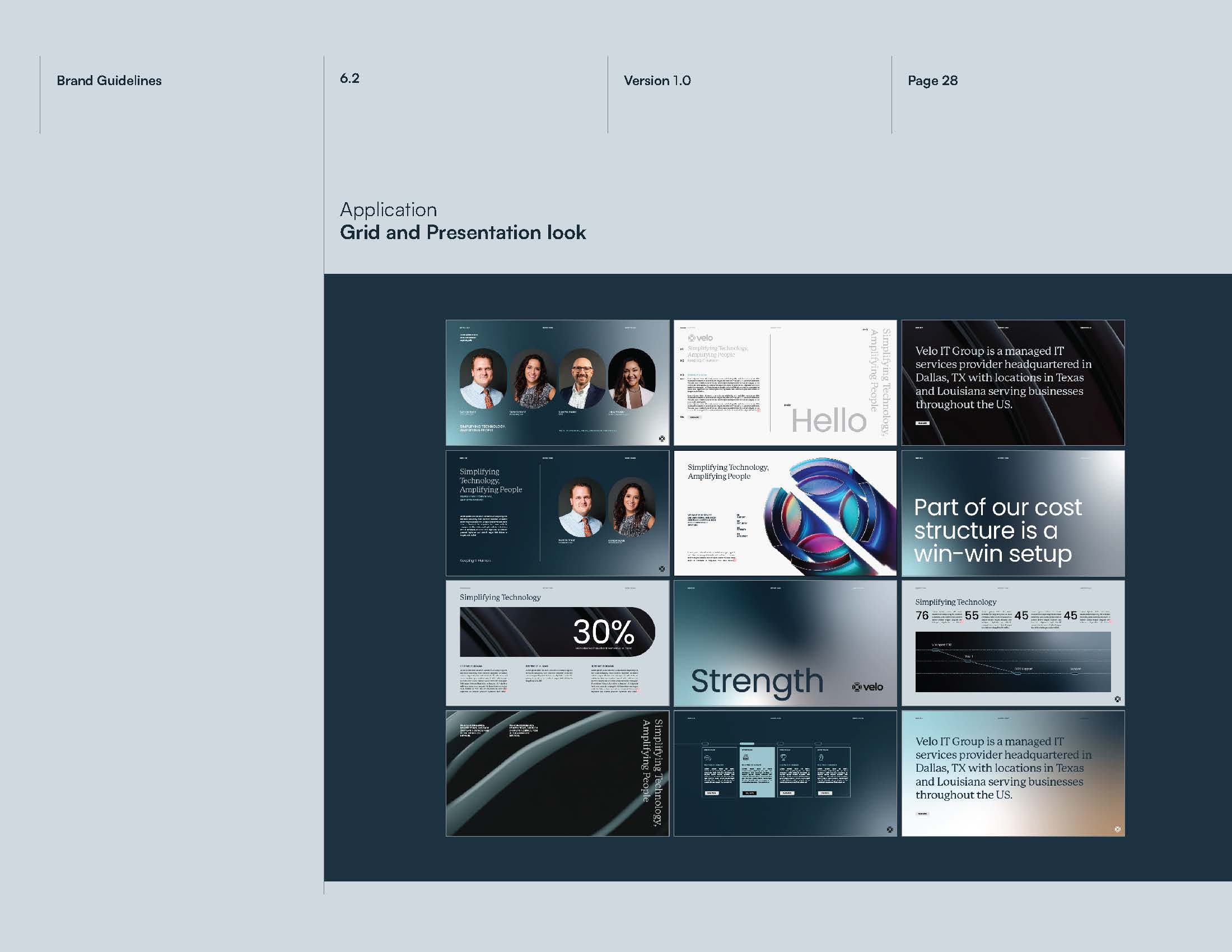
The rebrand was designed as a working toolkit rather than a single campaign. A consistent grid, typography hierarchy, color roles, image treatments, and reusable graphic elements give the team clear rules for creating new materials.
Testing the identity across presentation templates demonstrated how the system could move between bold statements, data, team content, and technical storytelling while still feeling unmistakably Velo.
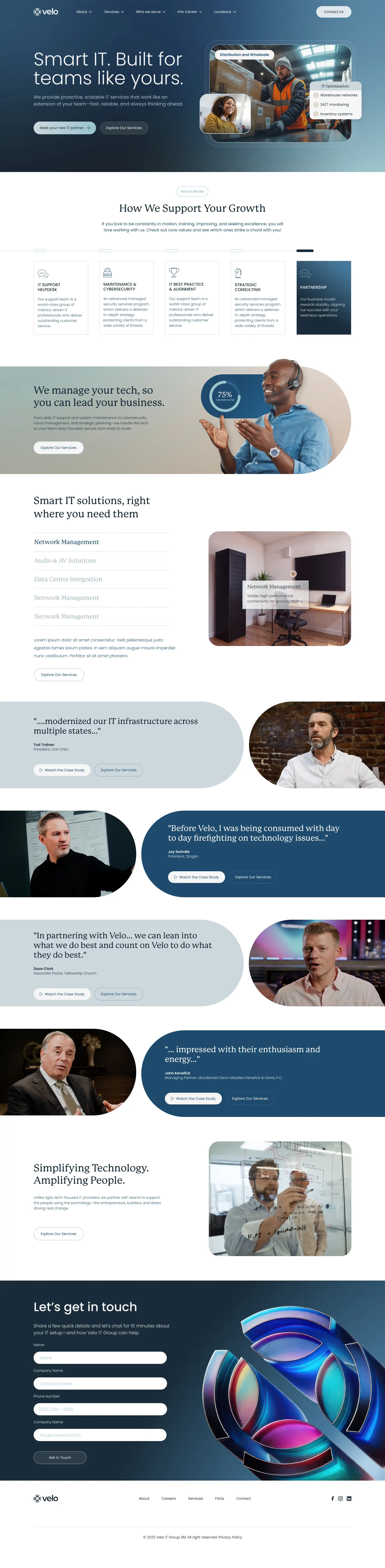
The Final Homepage
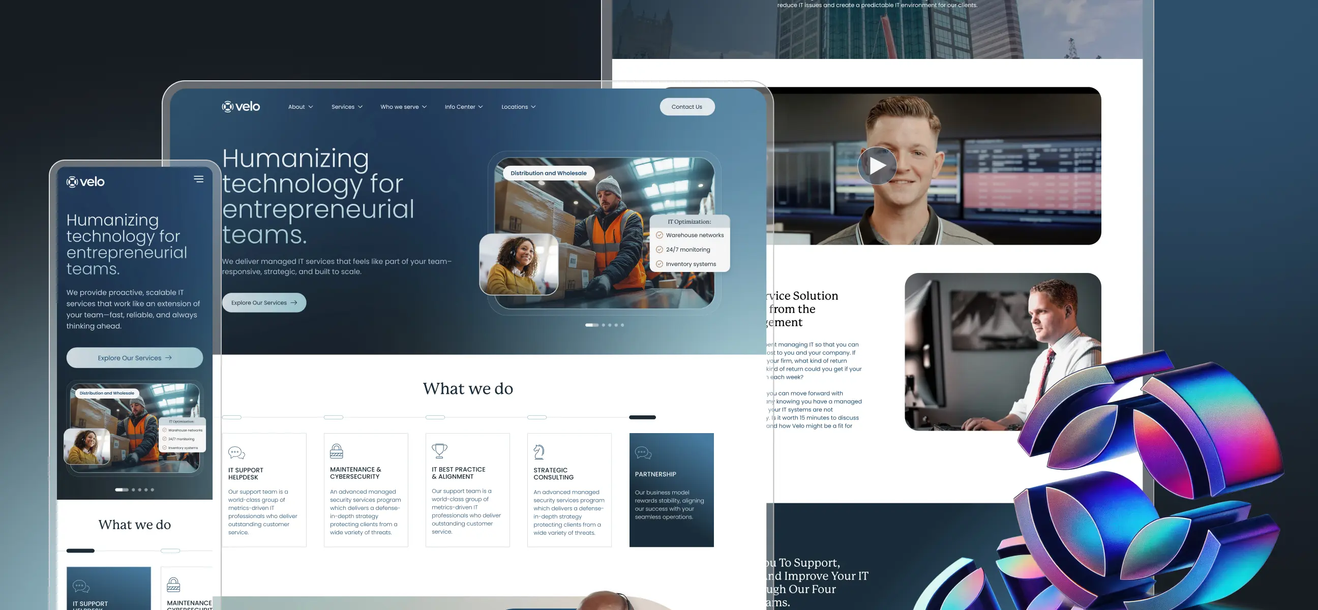
The homepage had to do more than introduce a new look. It needed to establish Velo’s positioning immediately, explain the breadth of its managed IT offering, and create a clear path for teams at different stages of the buying journey.
We structured the experience as a progressive story: a concise value proposition, partner credibility, scannable service pillars, outcome-led content, and client proof. The new visual system—gradients, capsule shapes, human photography, and precise cards—keeps each section distinct while making the page feel like one connected experience.
The Managed IT Services Experience
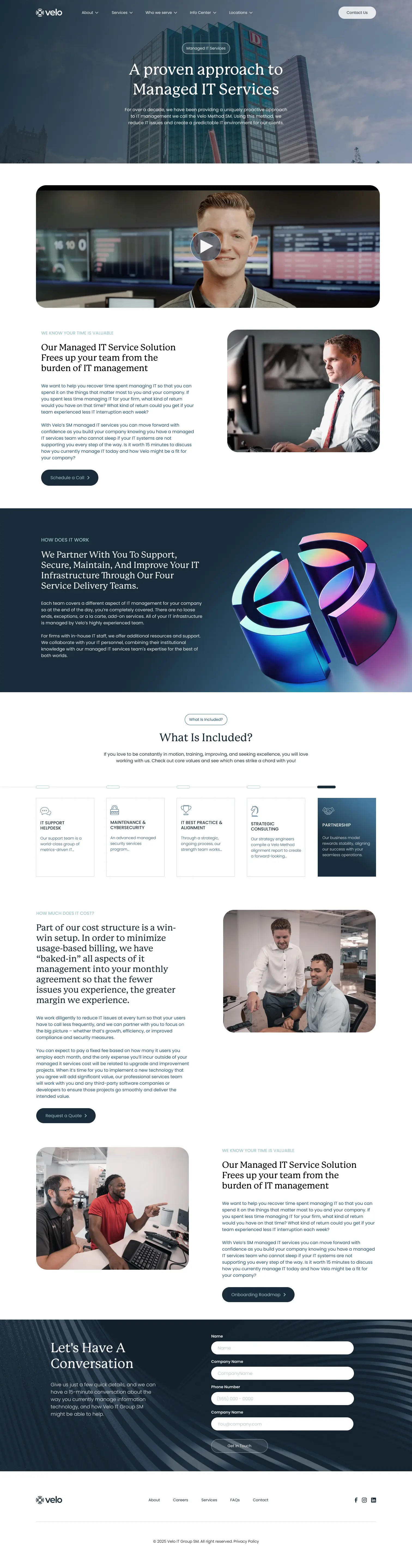
The managed services page takes a more focused approach. Rather than opening with a list of technical capabilities, it begins with Velo’s method and the business problem it solves: reducing day-to-day IT friction so teams can stay focused on their work.
Video, alternating image-and-copy layouts, the four service-delivery teams, and a concise “What Is Included?” framework break the offer into understandable pieces. The page moves from context to process, then from process to a clear switching decision and conversation.
Designing for Trust & Conversion
For a long-term IT partner, proof matters as much as explanation. We used client stories, video-led testimonials, familiar faces, and clear service calls to action to make trust visible throughout the experience rather than isolating it in a single testimonial section.
Calls to action are introduced at natural decision points and culminate in a low-friction contact form. This keeps the experience useful for visitors who are still learning while giving ready-to-talk prospects a direct next step.
The Velo Story
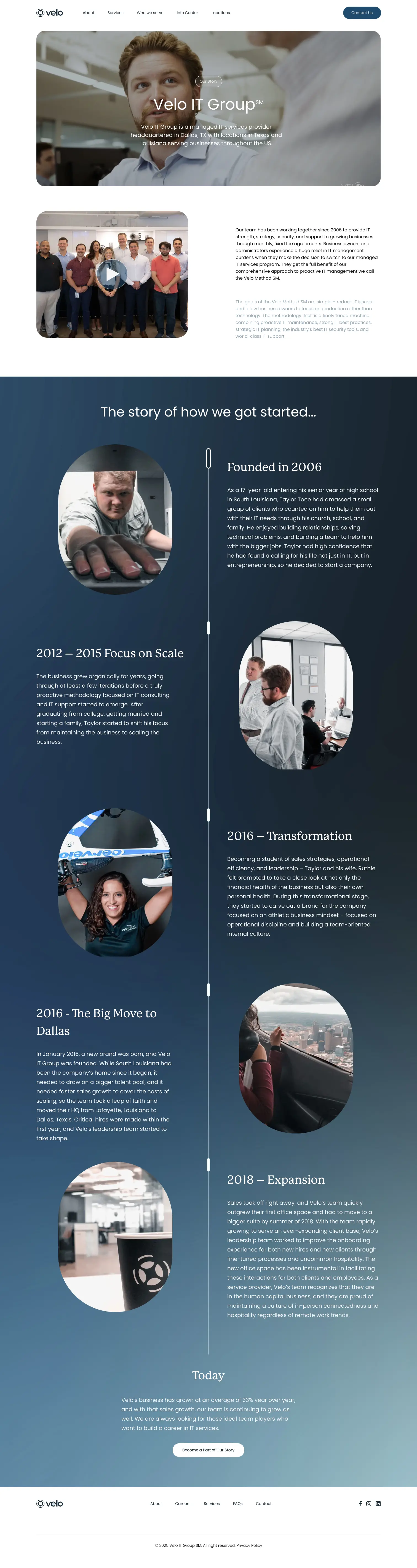
The Our Story page gives the brand a more personal dimension. It combines team video, the company’s origin, and a chronological timeline that follows Velo from its founding in 2006 through periods of scale, transformation, expansion, and the organization it is today.
Large editorial typography, a continuous timeline, and documentary-style photography turn business milestones into a human narrative. The result helps prospective clients and future employees understand not only what Velo does, but the people, ambition, and culture behind the company.
The Result
The final system gives Velo a more confident and memorable presence without sacrificing the professionalism its clients expect. What began as a muted identity became a modern brand with a clear point of view: precise but approachable, sophisticated but human, and unmistakably connected to technology.
The rebrand and website now work as one experience. Complex services are easier to understand, the identity has more personality, and Velo’s team has a scalable visual framework for future digital products, presentations, campaigns, and business growth.