Best Financial Planners
The Context
Money is looking to break into the advisor space by creating “Best Of” lists and a directory to help advisors boost their SEO and generate leads. The plan is to build a hub in collaboration with FPA, a leading organization for financial planners, to drive traffic to Money’s platform—creating a win-win financially. This approach taps into a new growth area to increase revenue opportunities. The target audience includes financial advisors and certified financial planners as potential partners through a membership model, and Money users as consumers of the advisor listings and profile pages.
The Problem
We were working under a tight deadline to have an MVP ready within four weeks for a major event for financial planners. Some competitors, like Barron’s and Forbes, already had established platforms and strong brand recognition, so we knew we had to stand out. Our goal was to create something modern and visually compelling to make a real impact. To compete, we needed a fresh approach that would attract consumers more effectively. We dove into competitor sites, analyzing what worked and identifying areas we could improve to set ourselves apart.
Research
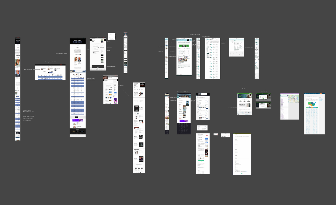
Our competitor research showed that similar platforms highlight featured planners, with each planner having their own profile page. Since the target demographic is mostly older users, we noticed they tend to search by expertise, years of experience, and location—key factors we kept in mind for our design. After speaking with active financial planners, we also learned that a rating system was common across competitors, making it clear that this feature was essential for us to include.
Low-Fi Wireframes
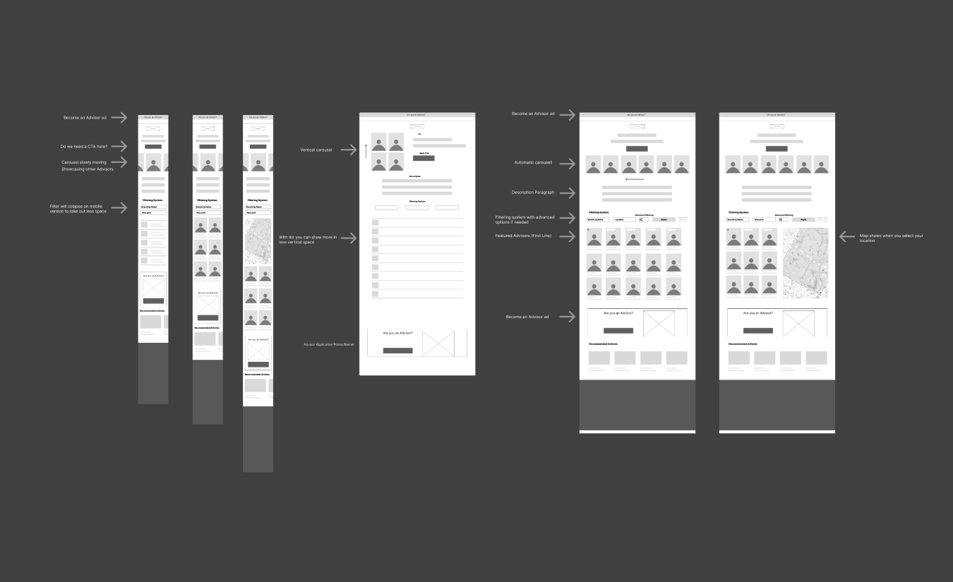
We started by creating low-fidelity wireframes to plan out the layout and sections. Inspired by Airbnb, we wanted to make finding an advisor as easy and intuitive as possible. That’s why we added a dynamic map with location pins that update in real time based on the user’s filter selections. The filtering system was a key feature, making it simple for users to find the right advisor and ensuring a smooth, enjoyable experience.
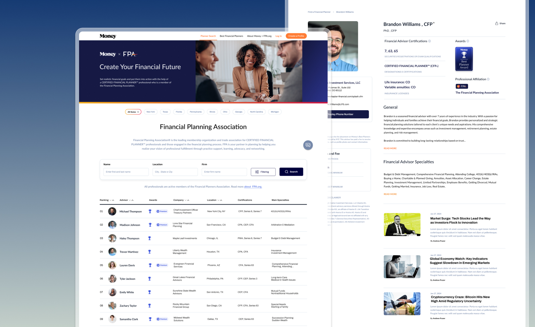
Best Financial Planners Hub
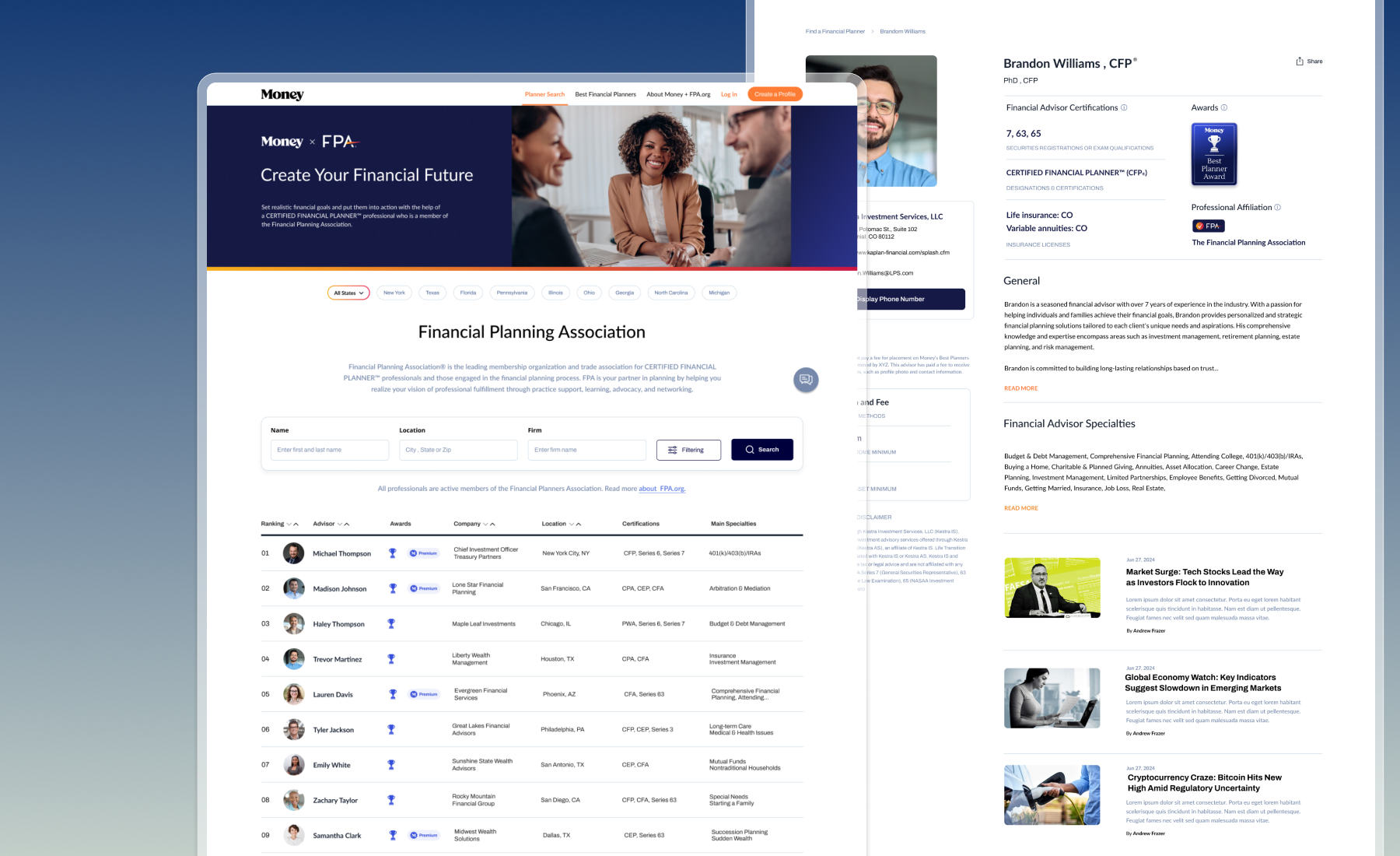
One of our biggest challenges was incorporating FPA’s branding into the hub while keeping the design functional and user-friendly. We needed to ensure the fonts, colors, and overall look aligned with FPA’s identity, making it feel like part of their family rather than Money.
Another challenge came when we removed the mapping functionality, requiring us to rethink how users could easily find a planner and how planners could manage their profiles. To drive premium memberships, we added standout features like badges, profile customization, blogs, videos, and higher rankings for better visibility.
We focused on a clean, modern, and professional design that balanced simplicity with enough detail to inform users. The search bar was a critical element, needing robust filtering and mobile optimization to handle the majority of user traffic seamlessly.
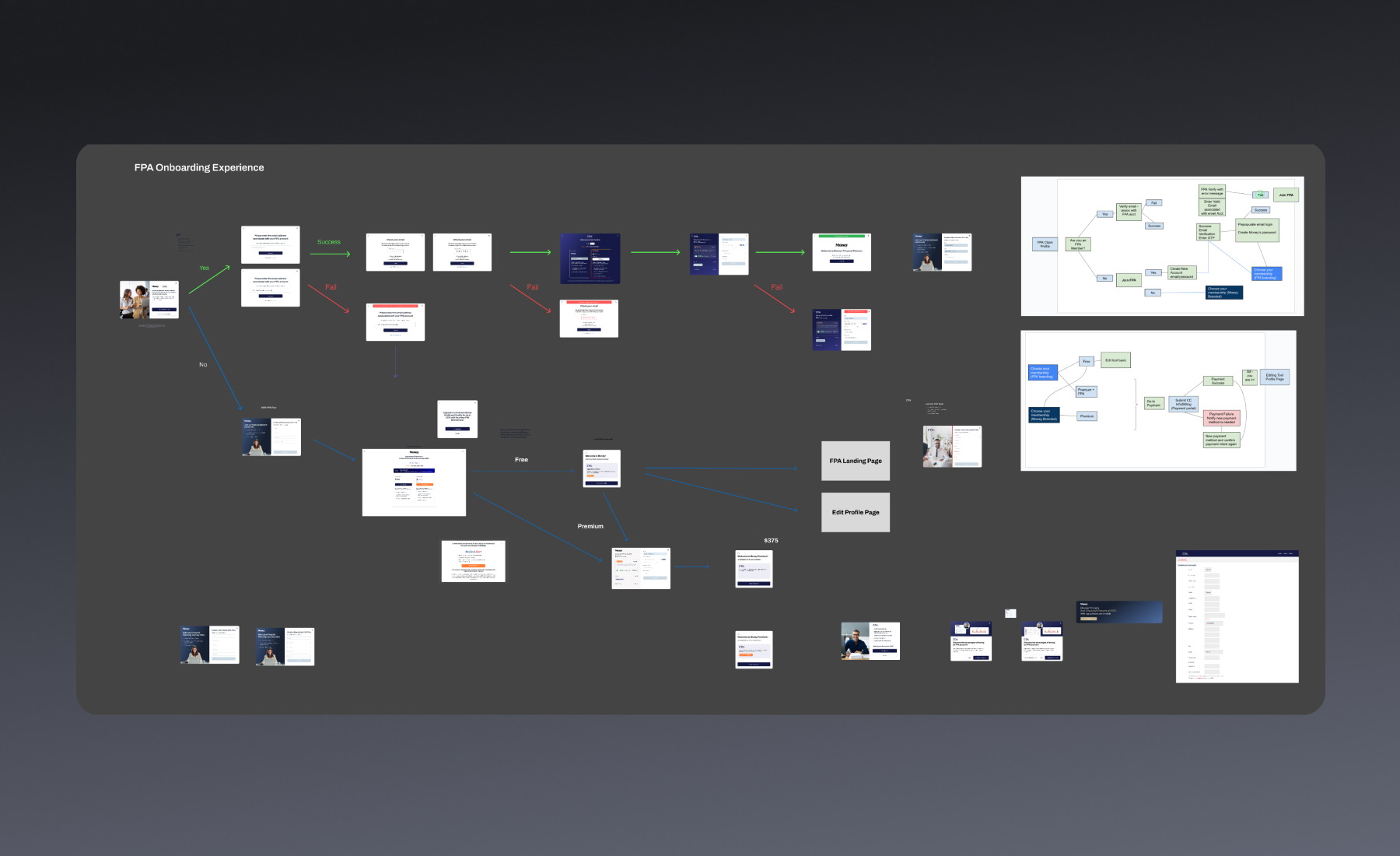
User Onboarding Flow
We created onboarding flows to guide both regular and premium users seamlessly. These flows introduced key features, highlighted the benefits of upgrading, and included an integrated payment option to make upgrading quick and easy.
Interactive Prototype Demo
To bring the experience beyond static screens, I created an interactive prototype that demonstrates how the product works as one connected journey. The walkthrough shows the navigation, advisor discovery experience, profile interactions, and the overall rhythm of the platform.
The prototype helped communicate the concept clearly, evaluate hierarchy and usability in context, and refine important interactions before development.