Thrive Dental Rebrand
Overview
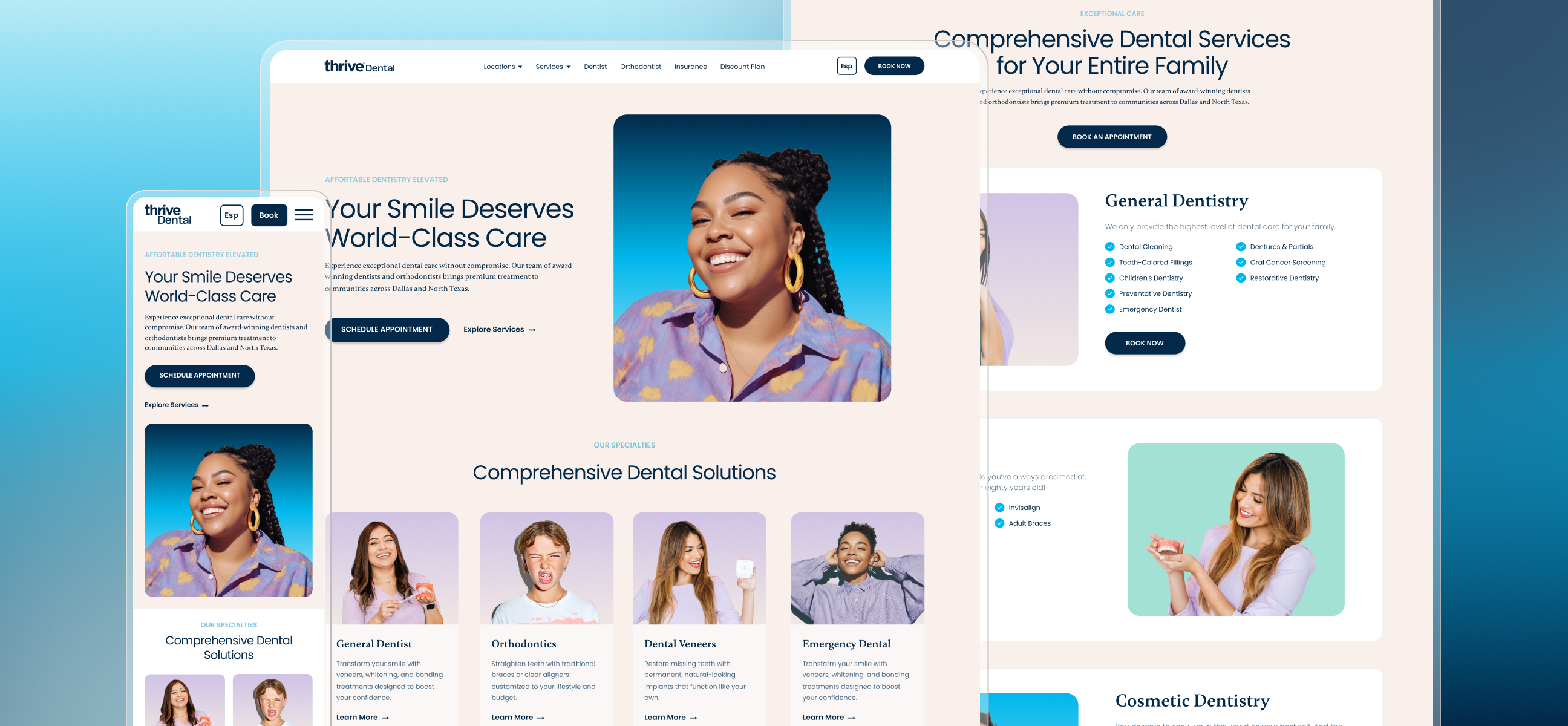
Thrive Dental is a multi-location dental group based in Dallas, with offices serving communities across Texas. The project brought together two connected goals: refreshing a brand that no longer reflected the organization and redesigning a large, established WordPress website without disrupting the foundation the business already depended on.
The opportunity was to create a more modern, playful, and human experience while preserving the trust expected from a healthcare brand. The new identity needed to work across the website, social media, print, signage, and every future location.
The Challenge
The previous visual identity felt traditional and disconnected from the energy of the company. Its typography, color palette, and imagery made the brand feel more old-school than welcoming, which did not represent the experience Thrive wanted patients to have.
The website added a second layer of complexity. It was an active WordPress platform with more than 100 existing URLs and slugs, established SEO, location content, service pages, and custom functionality. A conventional rebuild could have broken links, changed page relationships, or damaged years of search visibility.
This meant the work could not be treated as a blank canvas. The challenge was to create a noticeably new brand and digital experience while keeping the underlying information architecture familiar and stable.

Rebranding the System
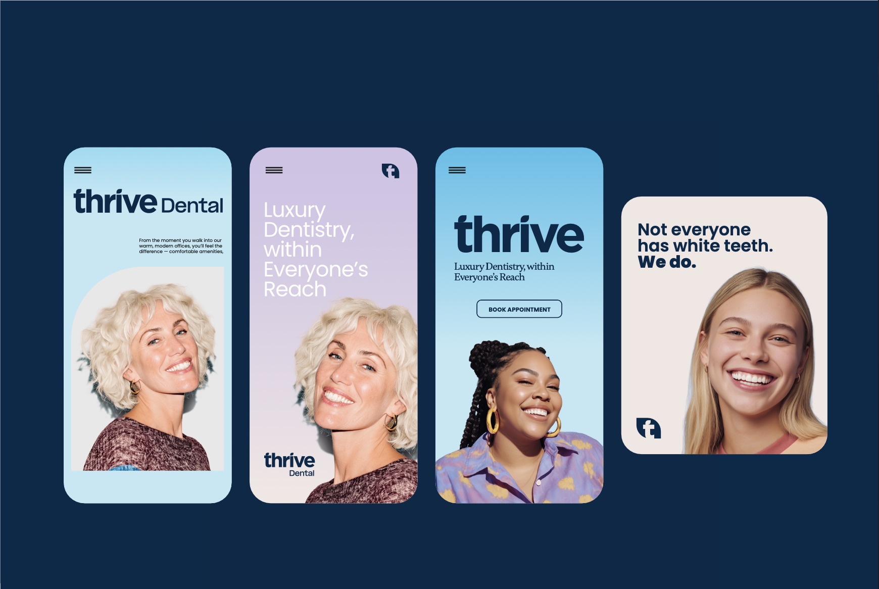
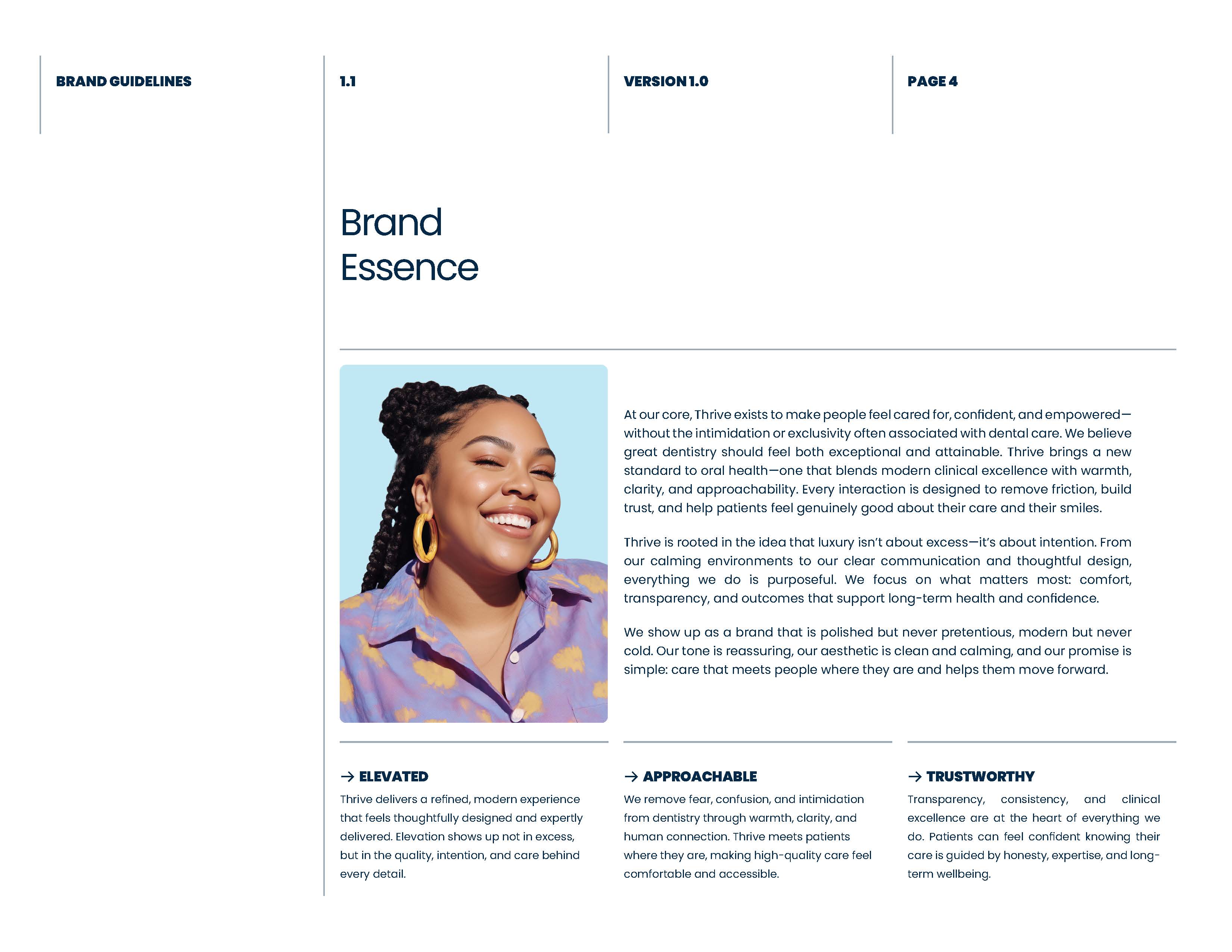
We rebuilt the identity around a simple idea: premium dental care should still feel approachable. The new system balances confidence with warmth, giving Thrive a visual presence that feels elevated, modern, calm, and distinctly human.
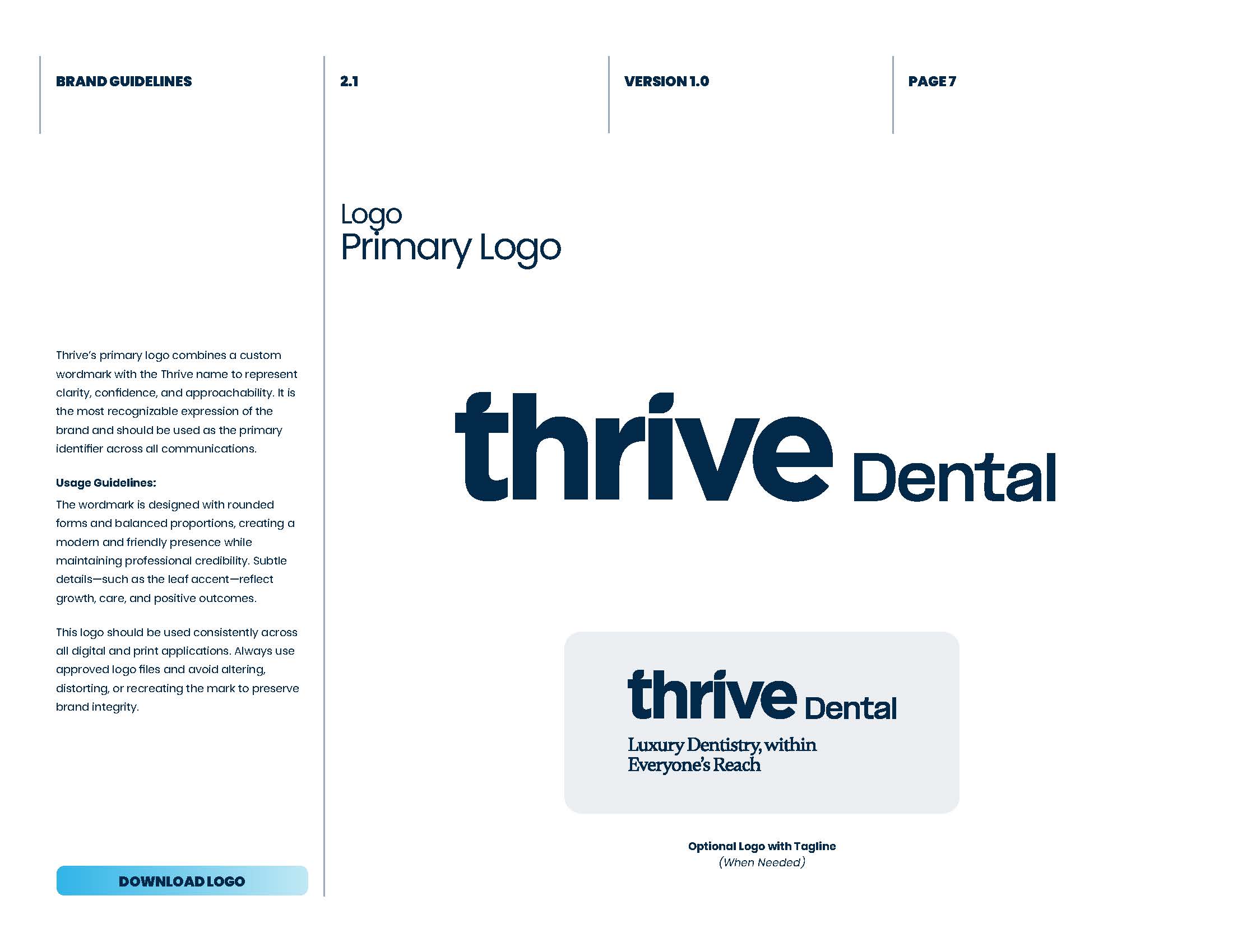
A Friendlier Mark
The new wordmark uses rounded forms and balanced proportions to feel clear and contemporary without losing professional credibility. A leaf detail introduces the idea of growth and care, while a compact icon gives the brand a recognizable asset for social media, signage, and smaller digital spaces.
Color With Purpose
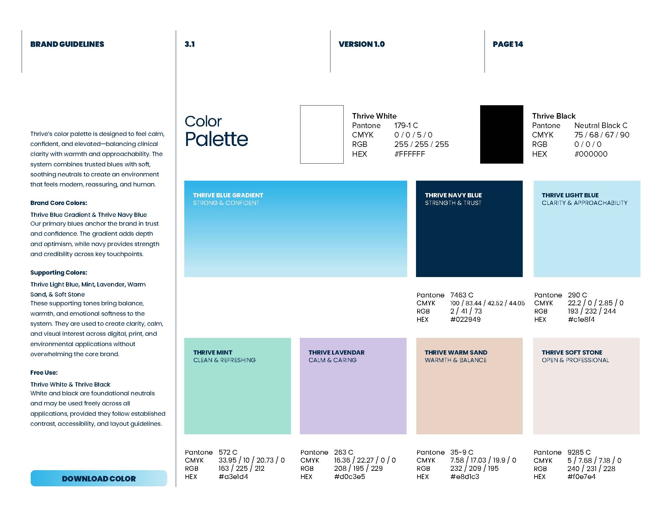
The palette moves beyond the muted look of the previous brand. Deep navy anchors the system in trust, while bright blue, mint, lavender, warm sand, and soft stone add optimism and personality. Together, the colors make the experience feel more playful without becoming childish or overly clinical.
The system was designed to scale across digital, print, and environmental applications so the brand could stay consistent from a patient’s first search to a physical office visit.
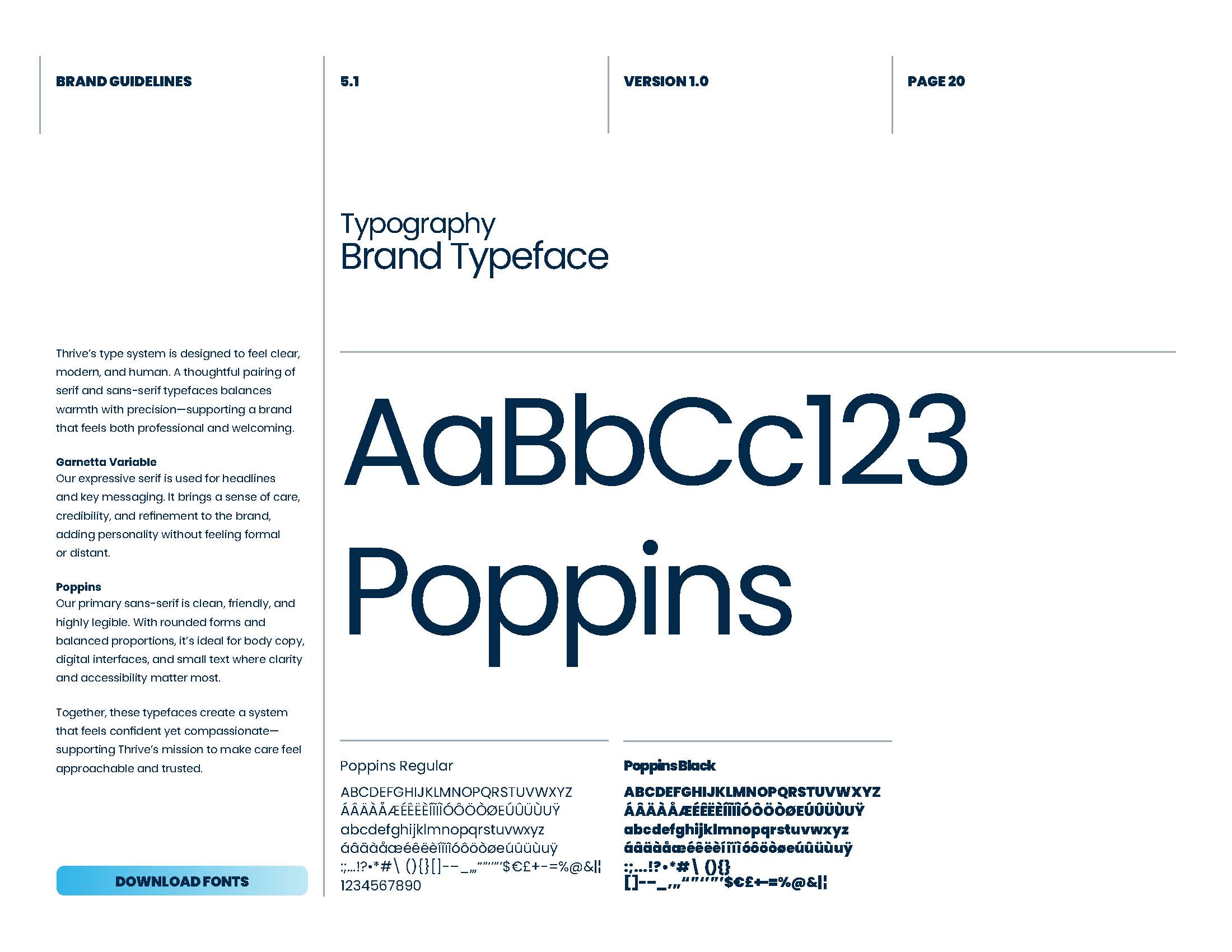
Typography & Voice
Typography helped establish the balance between modern clarity and warmth. Poppins creates a clean, highly legible foundation for navigation, body copy, and functional UI, while Gambetta adds a more expressive editorial voice to key headlines and moments of emphasis.
The contrast gives the system enough personality to feel memorable while keeping long-form service and location content easy to scan—an important requirement for a website with a large content footprint.
A More Human Image Language
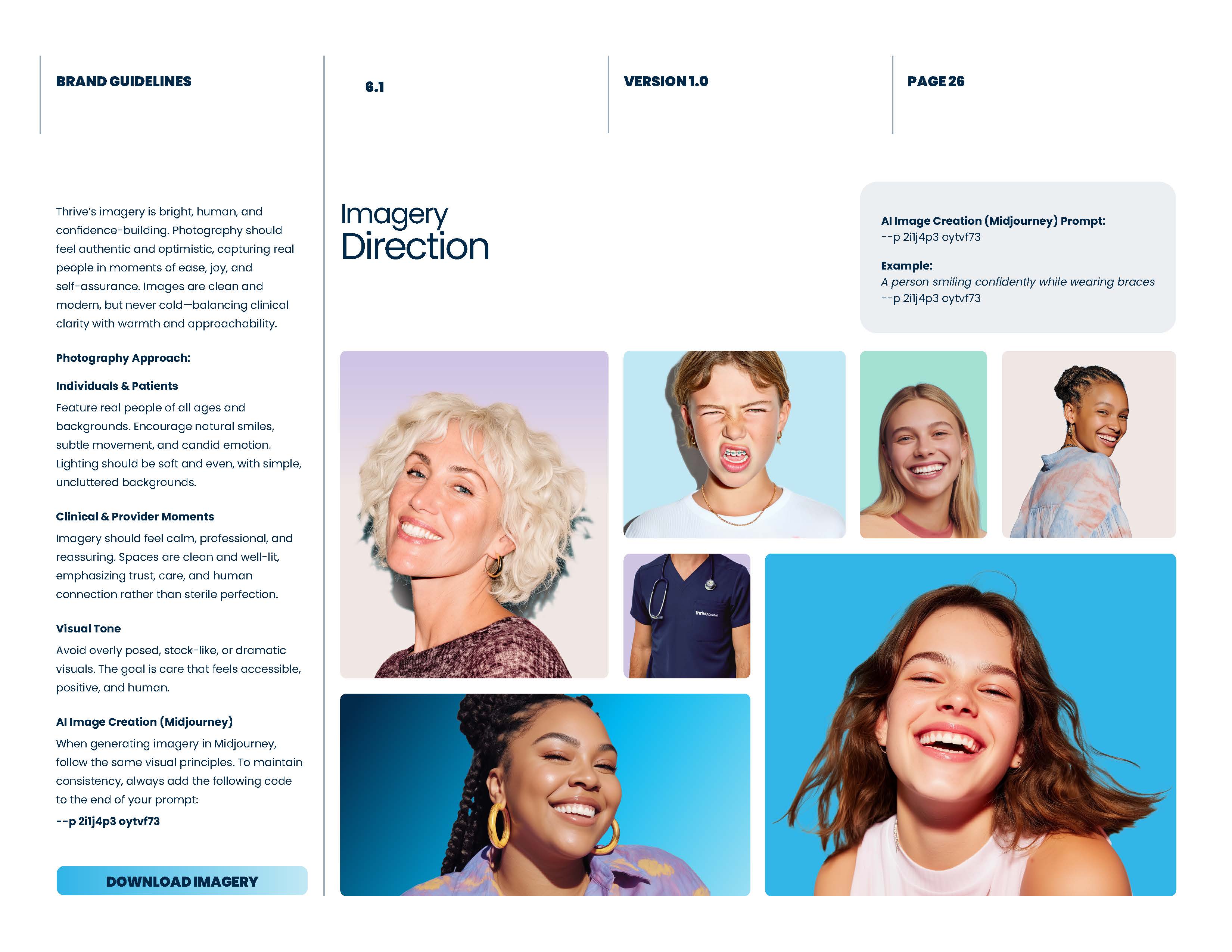
The imagery direction shifted toward bright, optimistic portraits that show real personality. Instead of relying on cold clinical photography, the system uses confident smiles, candid energy, inclusive casting, and soft color fields to make dental care feel more accessible and less intimidating.
These visual rules also created a repeatable framework for future campaigns, service pages, and location-specific content.
Bringing the Brand to Life
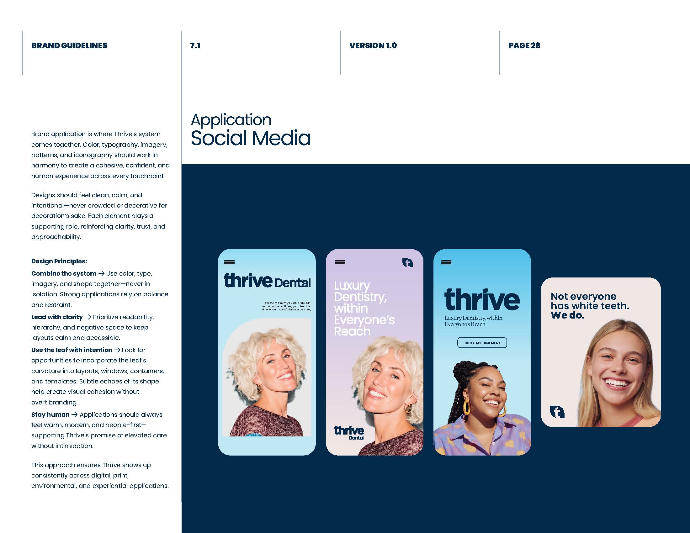
Once the core system was defined, we tested it across real touchpoints. Social templates, campaign graphics, signage, and print pieces helped confirm that the identity could remain recognizable while adapting to very different formats.
The consistent use of color, type, imagery, and the leaf-inspired graphic language created a flexible toolkit rather than a one-off visual treatment.
Designing Within an Existing WordPress System
The website redesign had to respect the existing structure. Rather than replacing the architecture, we mapped the new visual system onto the page templates, content hierarchy, navigation, and reusable components already supporting the site.
Maintaining more than 100 URLs and slugs required careful page-by-page work. Service pages, location pages, internal links, and calls to action had to remain familiar enough for the existing WordPress implementation while still feeling like part of the new brand.
This constraint shaped the design process: every visual improvement also had to be practical to implement, repeatable across templates, and safe for the site’s established SEO foundation.
Preserving Core Functionality
Some of the most important parts of the experience were also the easiest to disrupt. The location finder and interactive map, for example, needed a complete visual update while preserving the behavior patients relied on to find the nearest office.
We redesigned the surrounding content, location cards, controls, spacing, and visual hierarchy without changing the core interaction model. The same principle guided the rest of the site: improve the experience around the functionality, then verify that the original behavior still worked.
The Final Homepage
This is how the redesigned homepage came together as one complete experience. The new brand carries from the opening message through services, locations, patient benefits, team profiles, social proof, insurance information, and the final appointment call to action.

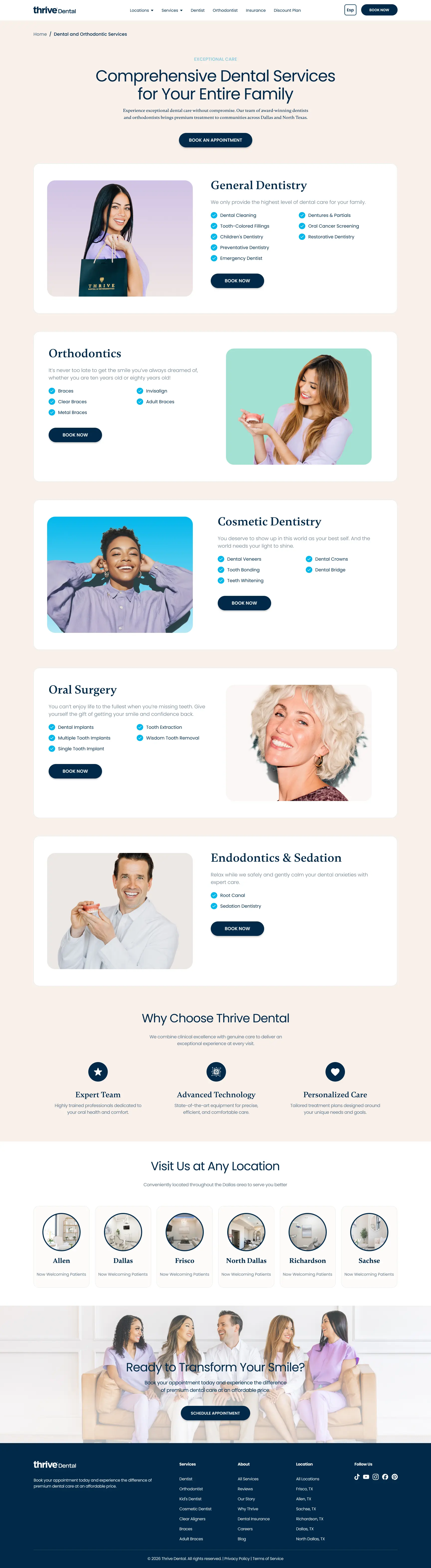
The Complete Services Experience
The service page extends the same system across a longer, information-rich journey. Treatment categories, approachable imagery, locations, trust signals, and booking actions remain visually consistent from the first screen through the footer.
The Result
The final experience gives Thrive Dental a brand that feels current, approachable, and scalable. The identity now has the flexibility to support digital products, campaigns, physical locations, and future growth without losing consistency.
The website feels substantially more modern while preserving the structure, URLs, and critical functionality behind it. The result is not simply a visual refresh—it is a cohesive system that brings the brand and product experience into alignment without sacrificing the foundation the business had already built.