Best Of's
The Context
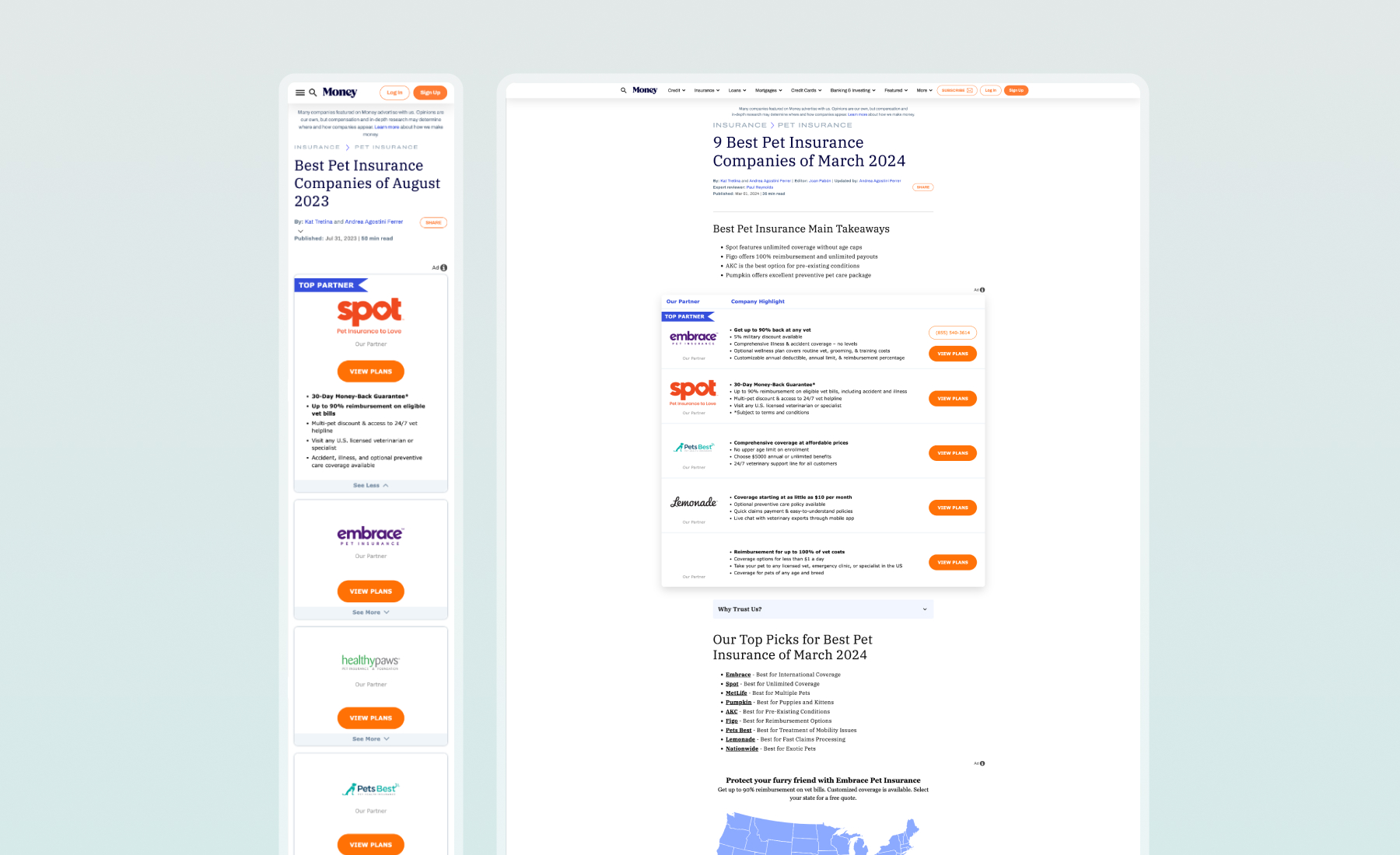
Money’s “Best Of” lists highlight the top options in different categories, like Best Credit Cards, Best Colleges, and Best Places to Travel. These pages are a major driver of traffic and revenue, as Money earns a commission when users click and convert with their partners. Since these pages are such an important part of the site, our goal was to improve their performance. We wanted to give them a fresh look while keeping the design familiar, so users could easily find and adapt to the content.
The Problem
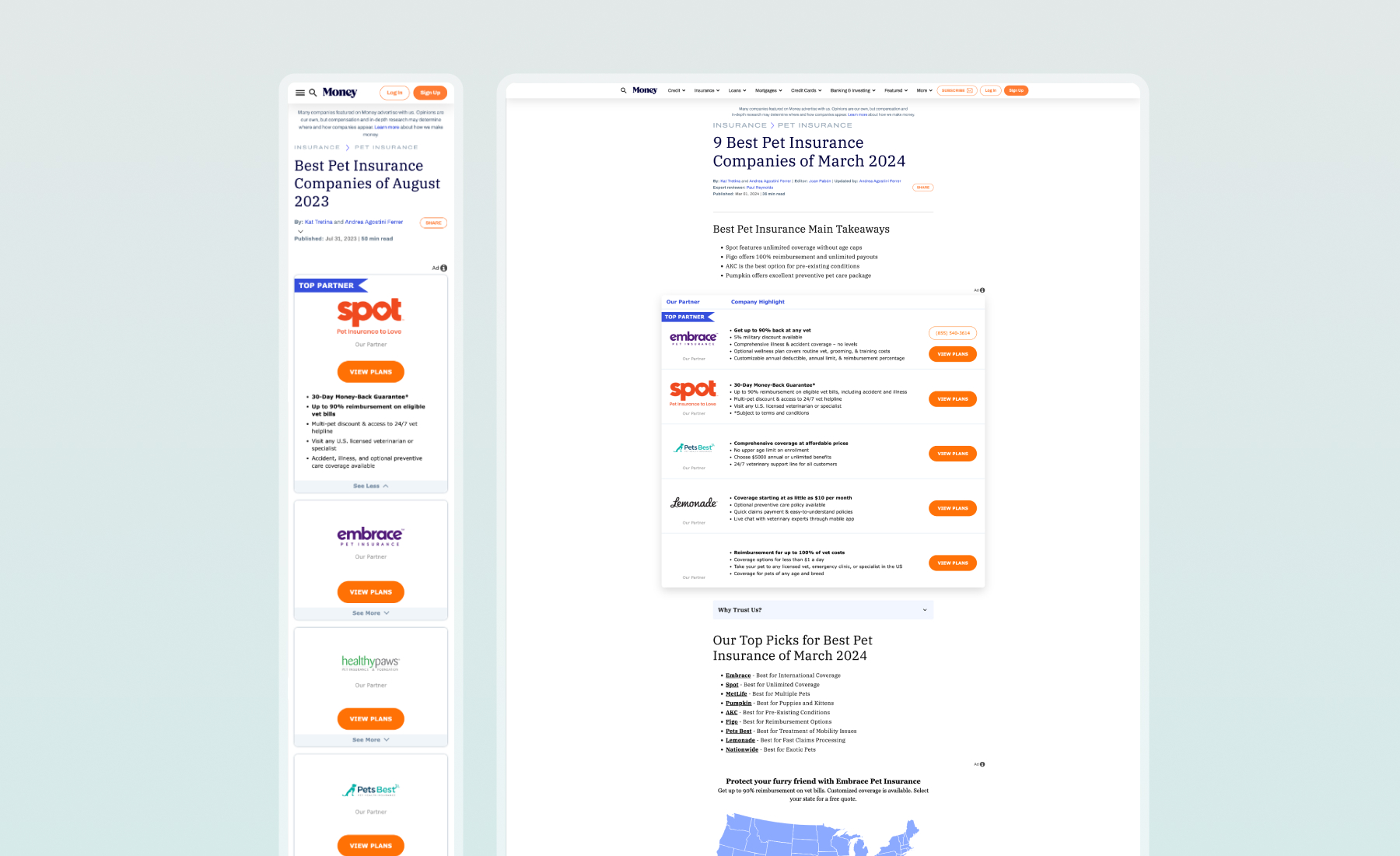
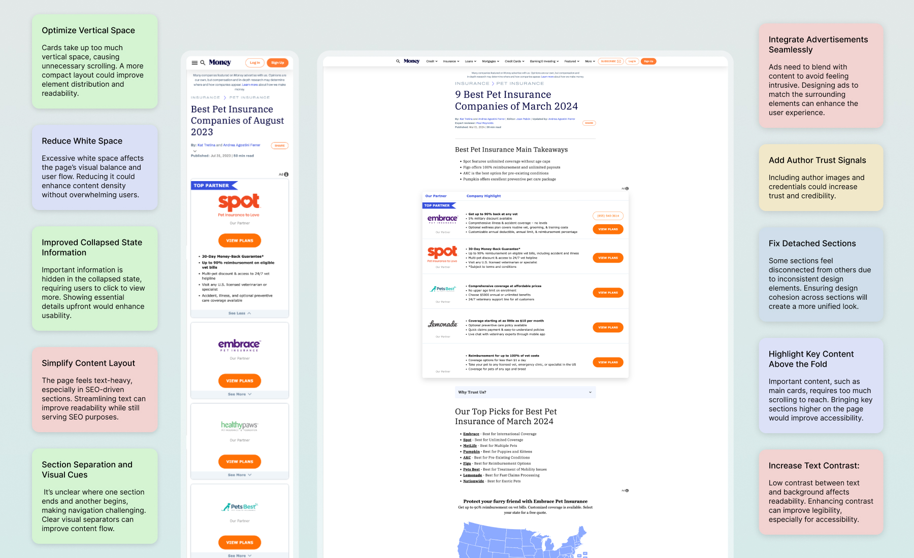
Since this page has a big economic impact on the company, we had to be especially mindful of how we presented partner companies to keep traffic and conversions high. The original design had some challenges: the cards took up too much vertical space, the information was sparse, and the sections weren’t clearly separated, making it hard for users to distinguish where one section ended and the next began.
A key challenge was reducing vertical scrolling on this one-page site while keeping the layout familiar so users wouldn’t feel overwhelmed. We also needed to seamlessly integrate widgets into the new design to ensure everything felt cohesive. Our approach was to introduce design improvements gradually, helping users adjust to the updates. At the same time, we paid close attention to SEO to make sure the page’s performance wouldn’t take a hit.
The Objective
Our goal is to give the design a modern update, adding new features and making better use of space. We’re focused on reducing vertical scrolling, improving performance, and keeping a familiar look and feel to stay competitive.
Low-Fi Wireframes
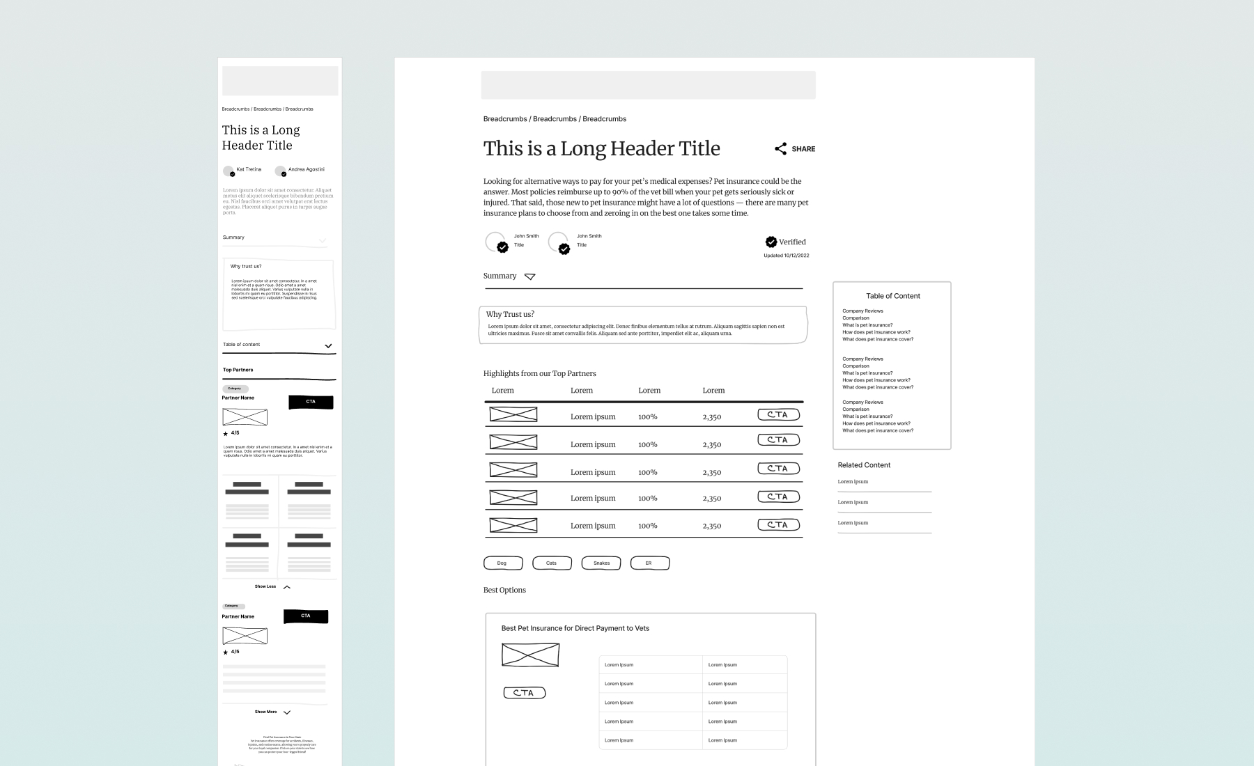
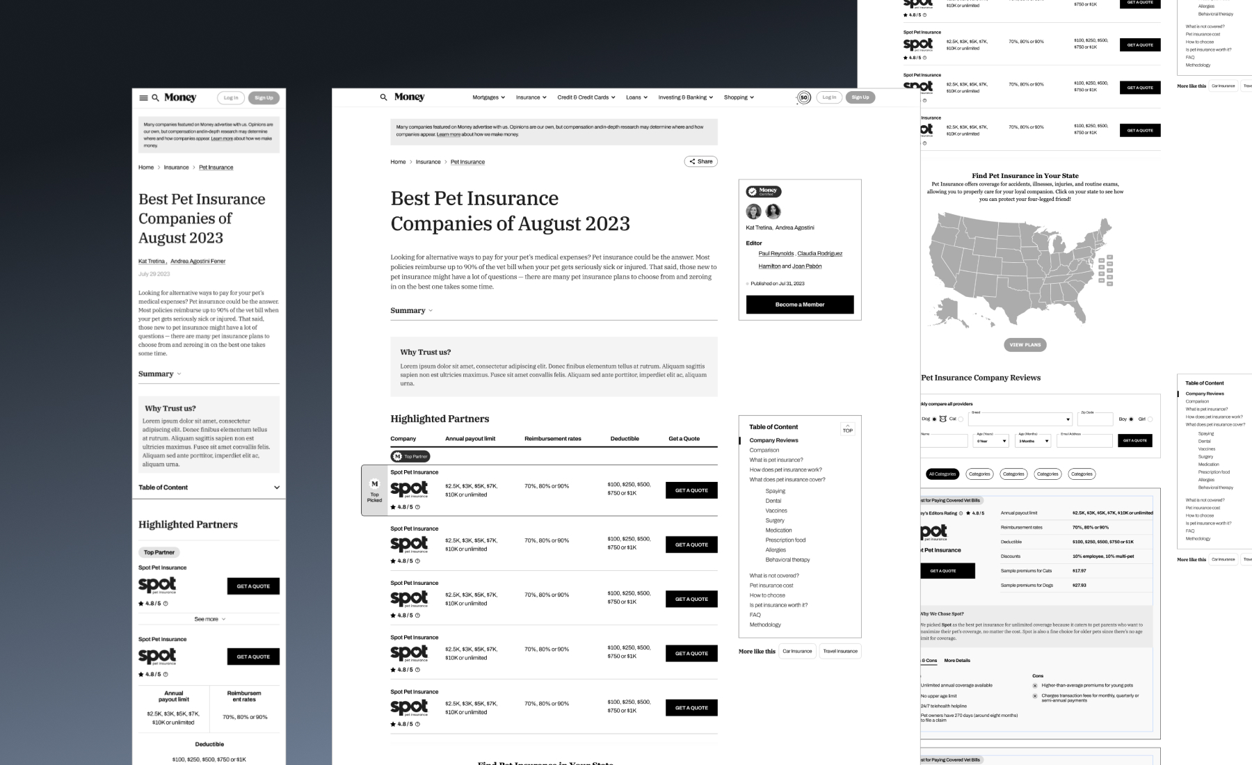
We started by creating low-fidelity wireframes to explore a new layout that makes better use of space. This helped us get a clear sense of the structure and where we could add new features. Given the amount of vertical content, we introduced a table of contents to make navigation easier and set clear expectations for users. This also led us to adopt a two-column layout, making better use of previously unused white space. We used this opportunity to add missing elements, like a “Why Trust Us?” section to build credibility, and sorting options to help us stand out from competitors.
Mid-Fi Wireframes
After running user tests with multiple participants, we tried different variations to see which performed best. Through trial and error, this version emerged as the top performer. Users appreciated the table of contents, finding it clear, organized, and helpful for navigating the page. They also liked the editor’s tile, which gave them insight into the people behind the list. The layout made sense for mobile users, too; by maximizing space, we were able to significantly reduce scrolling.
Final Design
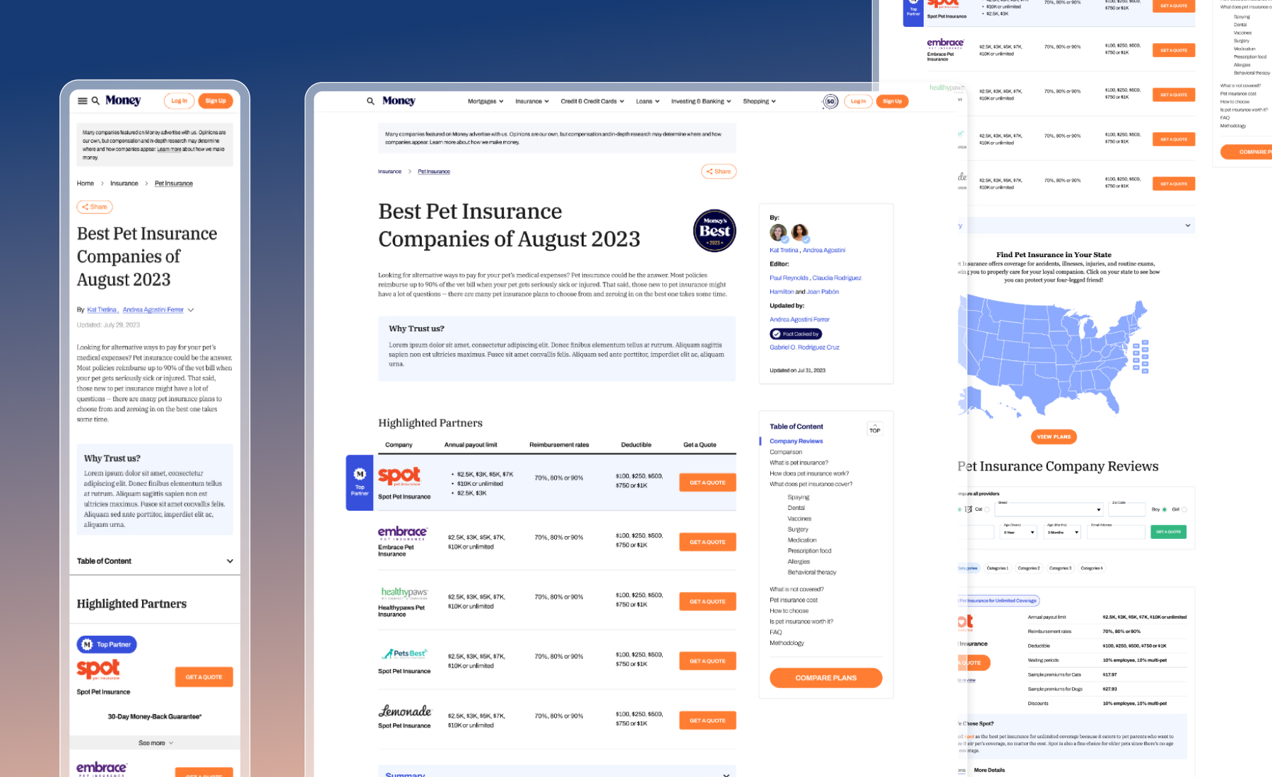
In the final design, we refined sections from the wireframes, like the “Authors” area, “Why Trust Us” tiles, and credibility badges, to boost user engagement and trust. We also applied Money’s branding—fonts, colors, and imagery—creating a cohesive, recognizable look. These updates, along with strategically placed badges, strengthen the brand presence and enhance the user experience throughout.
The Outcome
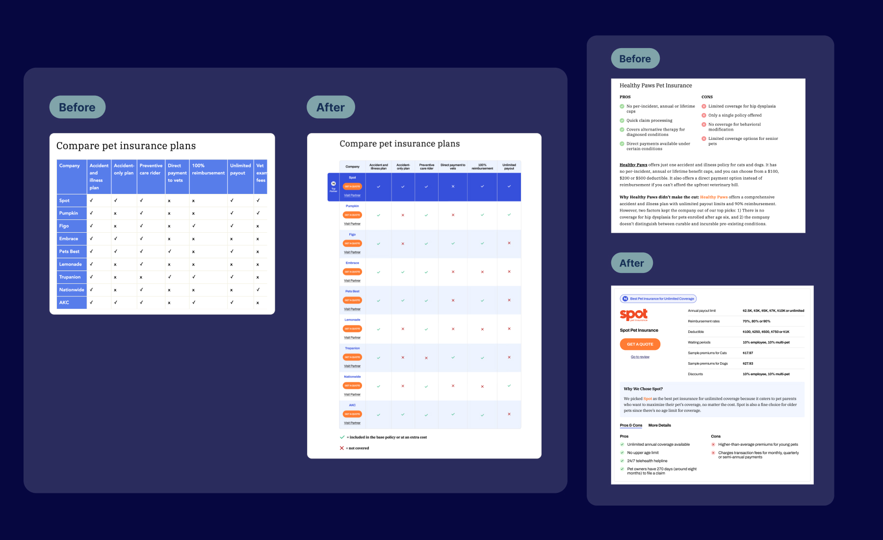
In our user testing, we found that the comparison table was one of the most popular sections, as users appreciated the ability to easily compare company features side-by-side. Our challenge was to highlight our primary partner (P1) in a way that felt balanced and kept the data credible.
Previously, users had to scroll back to the top to select a partner after reviewing the table. To address this, we added a CTA button and direct link to each partner within the table, allowing users to take action directly from the comparison section. We also added a “Compare Plans” CTA at the top to bring users straight to the table, which greatly improved navigation.
After launching the new design, the page performed significantly better overall, with higher engagement, and users responded positively to the new table of contents feature. These enhancements contributed to a 7% increase in user conversions.