Student Loans: The Slim Turnaround
A Critical Vertical in Trouble
Student Loans is one of Money’s largest and most seasonal verticals. During peak enrollment periods, a short performance window carries significant business impact. But the experience was not returning what we were spending to acquire traffic: ROAS was negative, and one of our most important verticals was actively losing money.
Most visitors arrived on mobile, and every week of the season mattered. By the time the performance problem was clear, we did not need another small visual adjustment. We needed a meaningful change that could help stop the loss while there was still time for the vertical to recover.
The Version That Was Losing
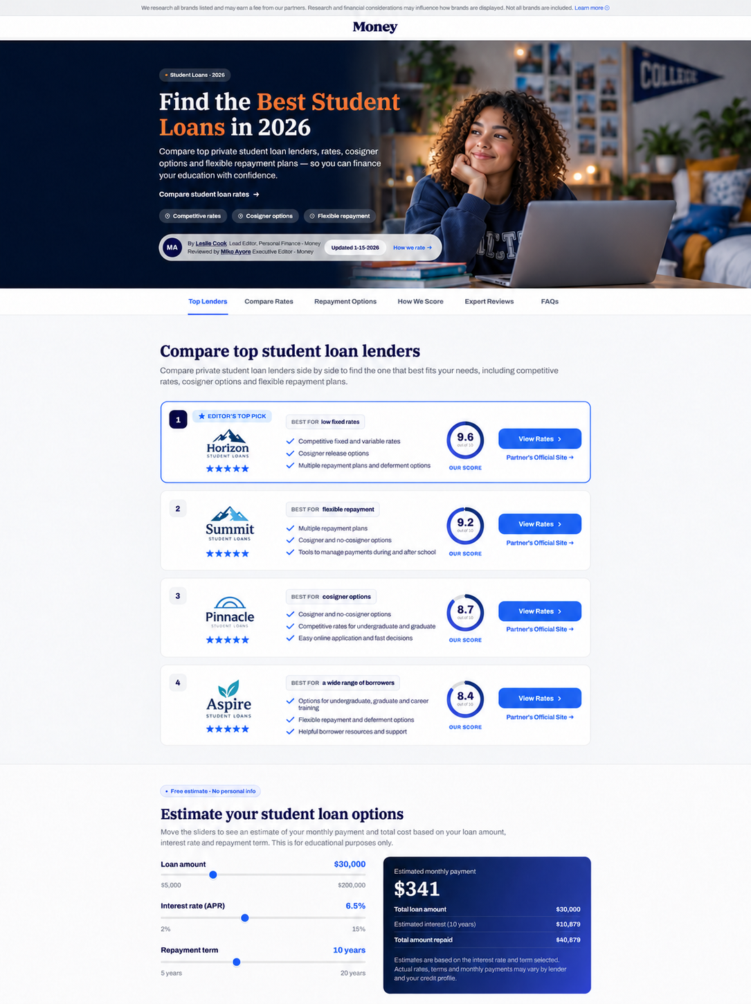
The original direction followed a highly visual editorial pattern: a large, emotionally engaging hero, lifestyle imagery, a bold headline, benefit messaging, and an immersive introduction before the lender comparison began.
It looked polished and created an immediate emotional connection. The performance told a different story. Partner click-through was not reaching the level the business needed, and the large visual introduction pushed the actual lender decision farther down the page—especially on mobile, where most of the traffic lived.
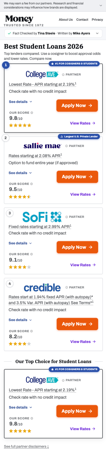
The original Student Loans page was not preserved. The image below is a clearly labeled reconstruction based on the archived Money layout used by a comparable vertical, adapted only to communicate the visual hypothesis we tested.
The Situation Became Urgent
This was no longer an abstract design exercise. Paid traffic was entering a page that was not converting strongly enough, the vertical remained in negative ROAS, and the seasonal window continued to move forward.
We could not keep polishing around the edges and hope the numbers changed. The business needed a response. The priority shifted from protecting the visual concept to removing anything that might be slowing visitors down before they reached a lender.
The Emergency Reset
With the season moving and the page still losing money, we made a more drastic call: strip the experience back to the decision itself. The oversized hero, lifestyle image, and decorative storytelling were removed. The author information became more compact, the introduction became more direct, and the first ranked lender moved dramatically closer to the top.
The slim version was not born from a confident belief that minimal design would win. It was a recovery move—almost a last meaningful lever. We reduced the variables, prioritized rates, rankings, proof points, and the Apply Now action, then launched it to see whether a much more direct experience could change the trajectory.
The Slim Version
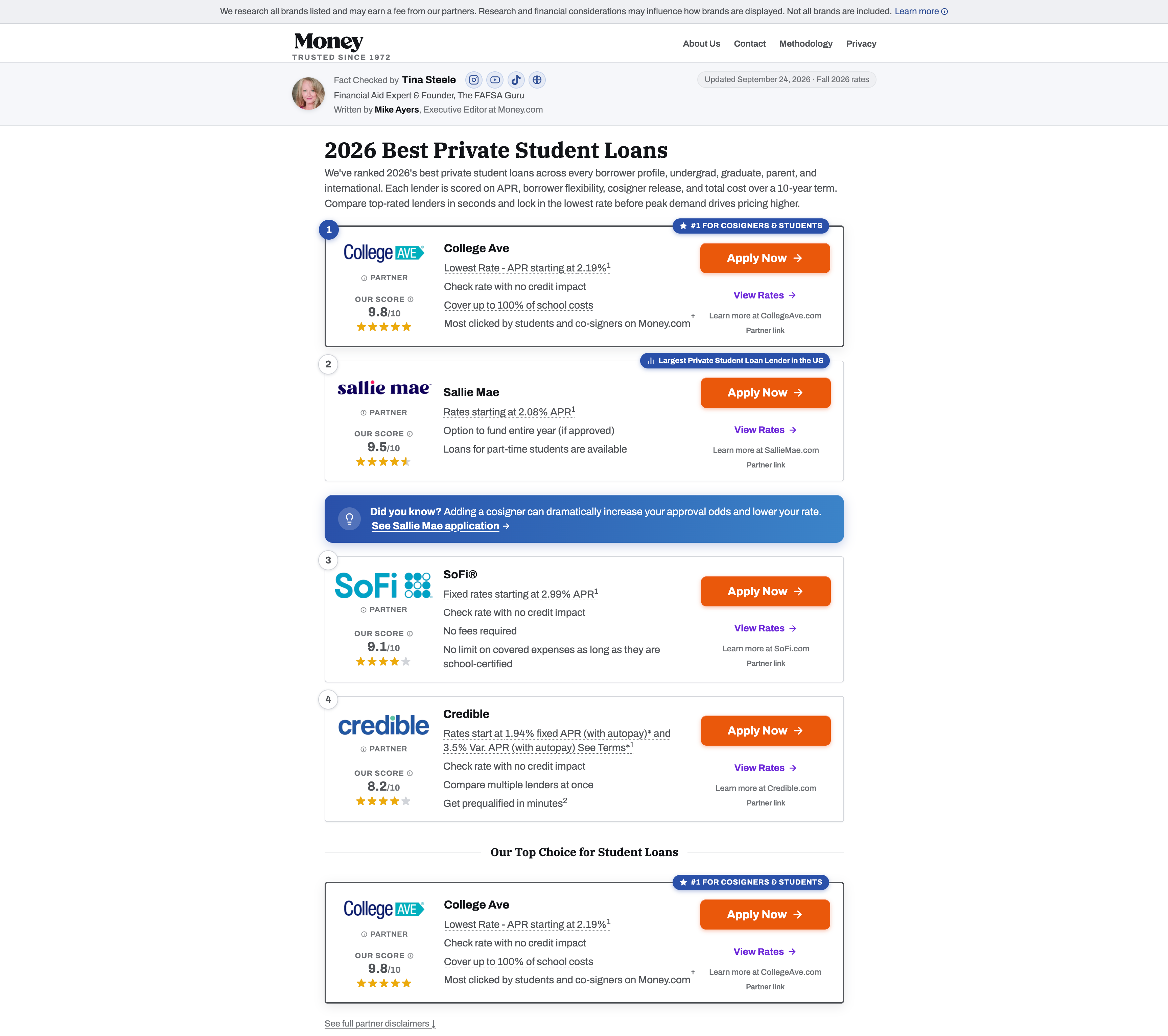
On mobile, the reset compressed the complete value proposition into the smallest useful space. Visitors could see the category, understand the first recommendation, evaluate its rate and score, and reach the primary CTA without moving through a large visual preamble.
The cards preserved trust and detail, but reorganized them into a fast vertical rhythm. Each lender followed the same sequence—rank, identity, offer, supporting detail, score, and action—so comparison became easier with every card.
The Fold Became the Story
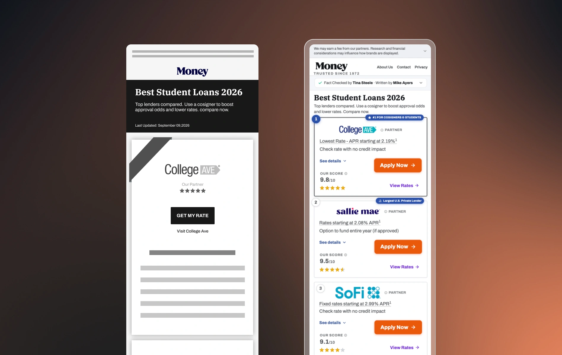
The legacy page did contain multiple lenders, but the first mobile viewport told a different story. Most of the screen was consumed by disclosure, branding, the editorial hero, and one oversized P1 card. Before scrolling, the experience could feel less like an independent comparison and more like a page selling a single featured partner.
The slim version changed that perception immediately. By compressing the introduction and tightening each card, visitors could see the first recommendation and the beginning of another option above the fold. We learned that this glimpse of a second card was not simply a density improvement—it was an important comprehension signal that made the page read as a comparison from the start.
What Changed Above the Fold
The key learning was not simply that the slim page fit more content. Showing the beginning of a second lender card helped users understand that they were looking at a ranked comparison—not a page built only to sell the P1 partner.
- The lender comparison became the opening experience instead of the second act.
- High-intent information—rates, rankings, scores, and CTAs—appeared earlier.
- A shorter introduction reduced the distance between search intent and action.
- Consistent card anatomy made multiple providers easier to scan and compare.
- Mobile space was treated as a performance constraint, not a smaller canvas.
The Turnaround
To our relief, the drastic change worked. The slim experience increased partner click-through rate by nearly 30%. More importantly, the business outcome changed direction: ROAS moved from negative to positive during the critical seasonal window.
What began as an urgent attempt to stop the loss became a pattern we later carried into other high-intent comparison experiences, including Debt Consolidation: show useful options sooner, reduce non-decision space, and design the first viewport around what the user came to do.
Partner CTR
More visitors reached a lender after the emergency slim version launched.
ROAS
The vertical returned to profitable acquisition during a key seasonal period.
The Learning
The lesson was not that minimal pages always win. It was that a design can look right while the business outcome is clearly wrong. In this case, the large hero and emotional imagery made the page feel more impressive, but clarity and proximity to comparison were what helped reverse the loss.
The experience changed how we responded to underperformance. When the data shows that a critical product is losing money, the answer may require more than refinement. Sometimes the responsible move is to challenge the entire presentation, simplify aggressively, and let the outcome—not the visual ambition—decide what deserves to remain.