Debt Consolidation Responsive Redesign
Overview
ConsumersAdvocate.org helps people compare debt consolidation and debt relief providers. Because the page connects high-intent visitors with partners, it had to do two jobs at once: make a complicated financial decision feel understandable and support a revenue-critical acquisition model.
The redesign replaced a legacy experience with a modern responsive template built around decision density, trust, and qualified action. The goal was not simply to make the page look newer. It was to help users understand rank, fit, evidence, and next steps faster—especially on mobile, where the largest opportunity existed.
The Legacy Experience
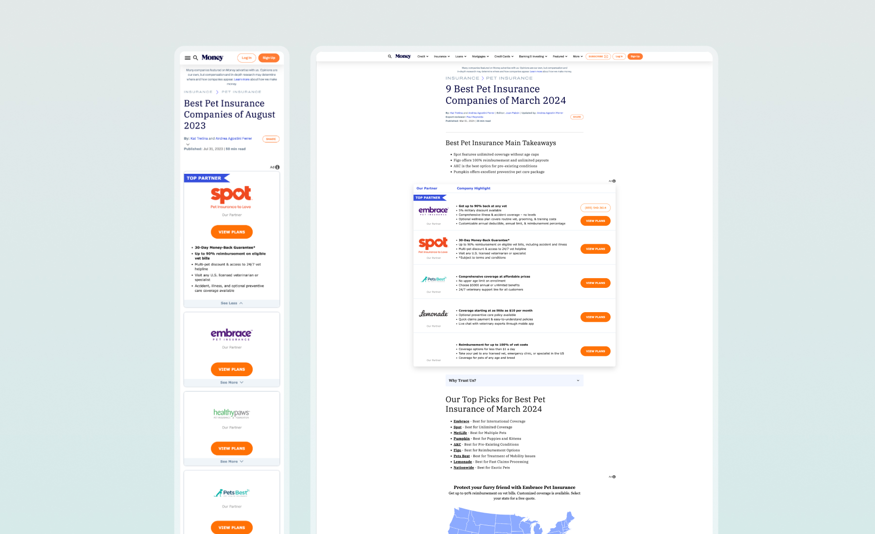
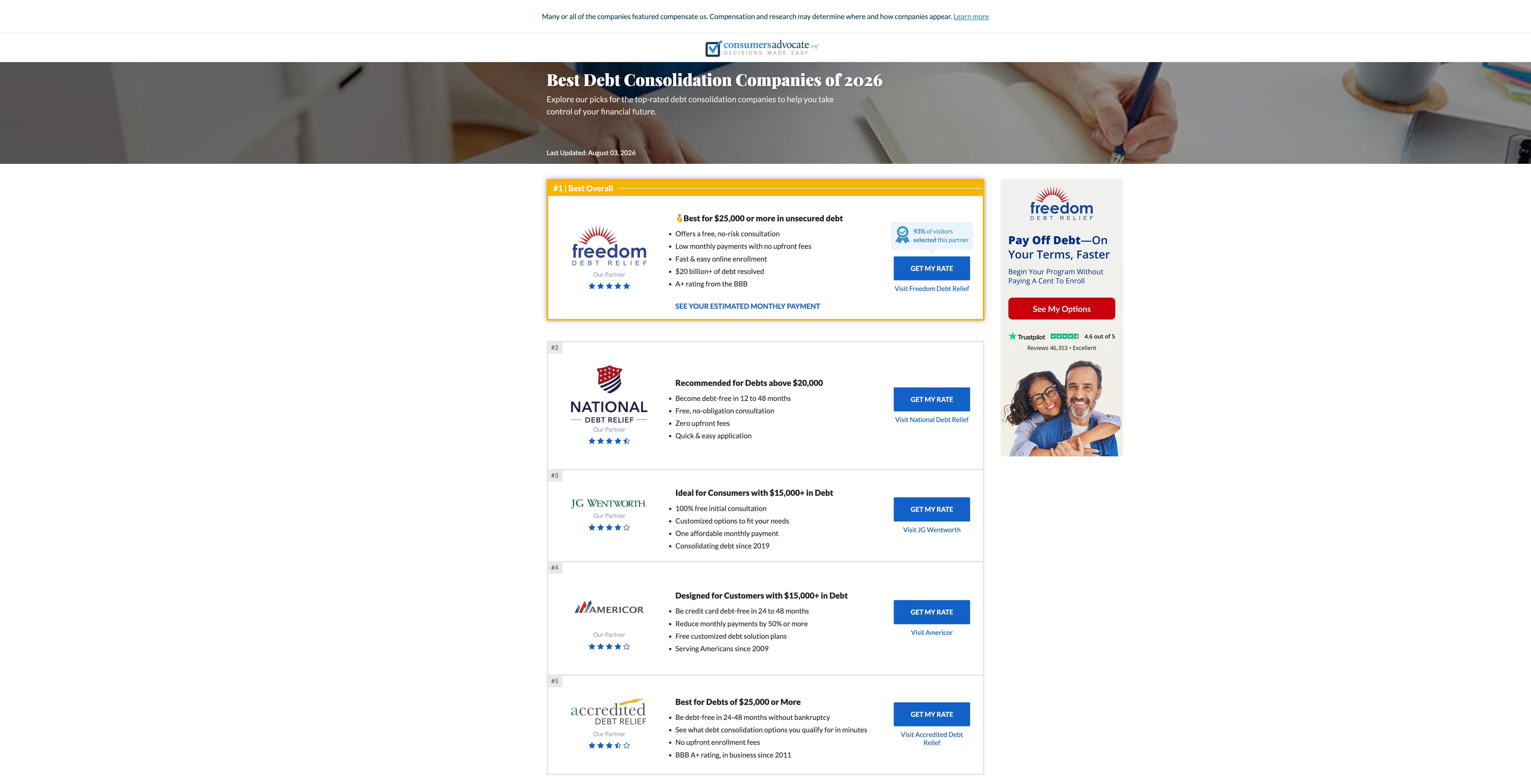
The original page used a large editorial hero followed by partner cards that consumed significant vertical space. Generic star ratings made providers look similar, important eligibility information competed with secondary details, and the primary CTA appeared before users had enough context to understand whether an offer fit their situation.
Mobile and desktop also relied on separate landing-page structures. That created additional QA, made content easier to drift out of sync, and limited how consistently improvements could be rolled out across devices.
Building From a Proven Mobile Pattern
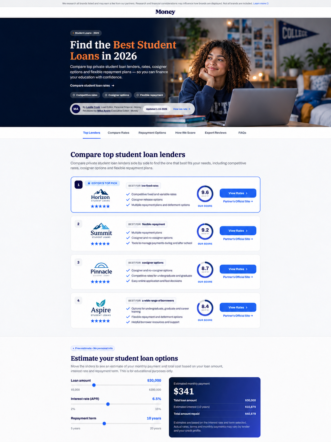
The new direction adapted a comparison pattern previously validated on the Student Loans experience. That mobile layout had produced a meaningful increase in click-through rate by bringing ranked options into view earlier and making each offer easier to evaluate.
Rather than copying the visual treatment, we transferred the behavior that made the pattern effective: less non-decision space, clearer provider hierarchy, stronger differentiation, and an action placed after users could understand fit and proof.
More Comparison in the First Screen
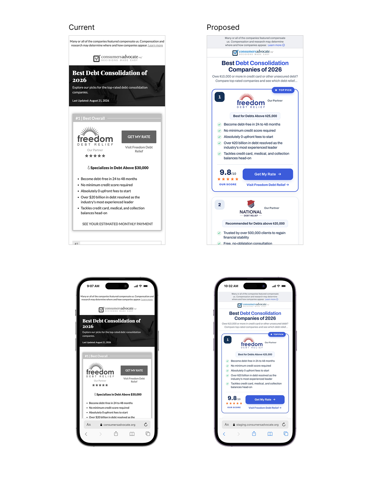
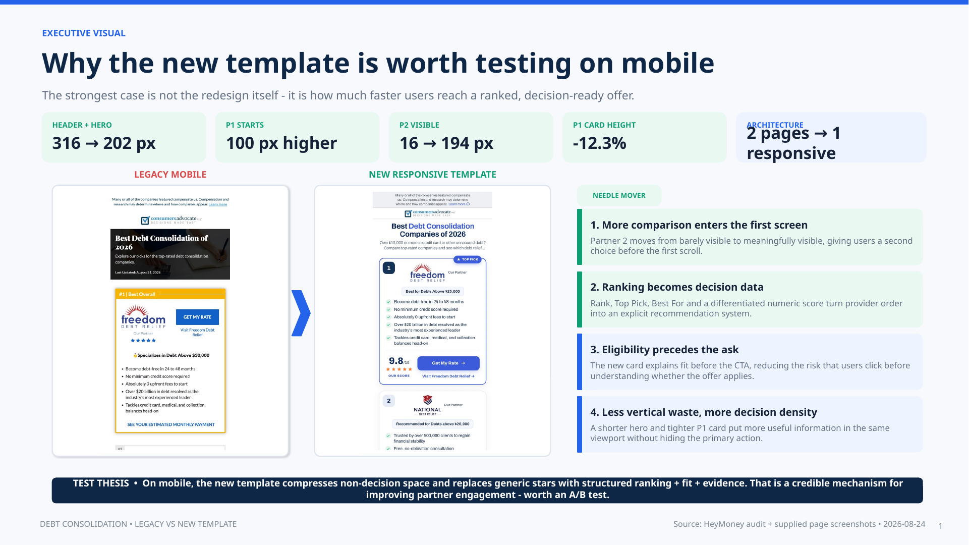
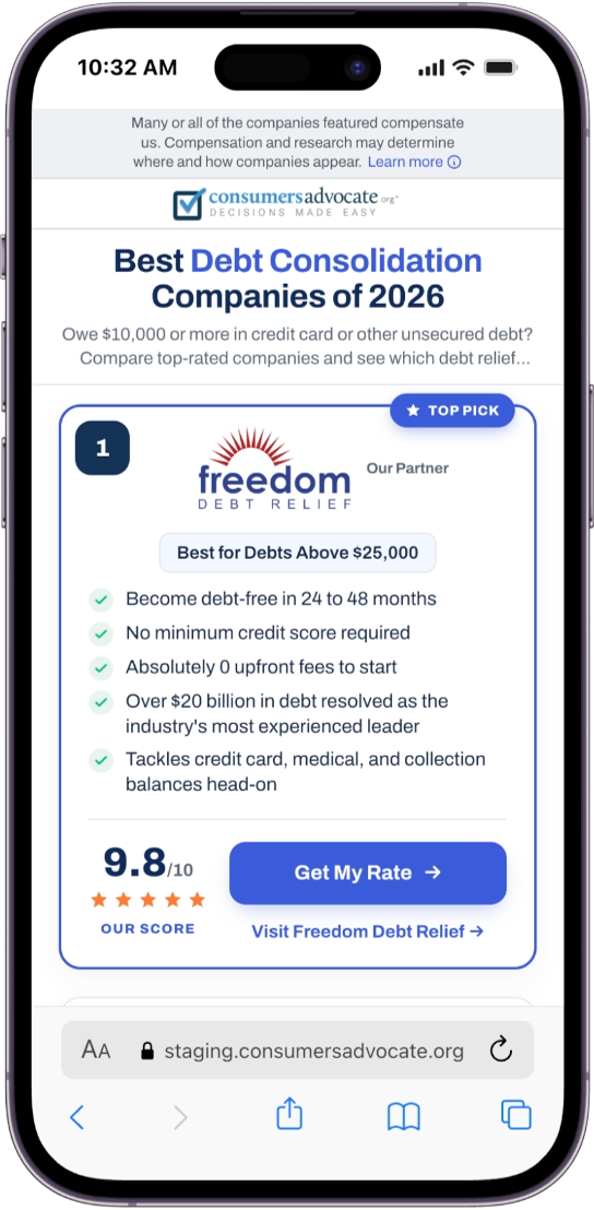
On mobile, the header and hero were reduced from 316 pixels to 202 pixels, allowing the first partner card to begin about 100 pixels higher. The visible portion of the second-ranked provider increased from only 16 pixels to 194 pixels, giving users a meaningful second option before the first scroll.
The change was deliberately about useful density, not simply compression. A shorter introduction and more efficient card made room for comparison while keeping the primary action visible and easy to tap.
A Stronger Decision Architecture
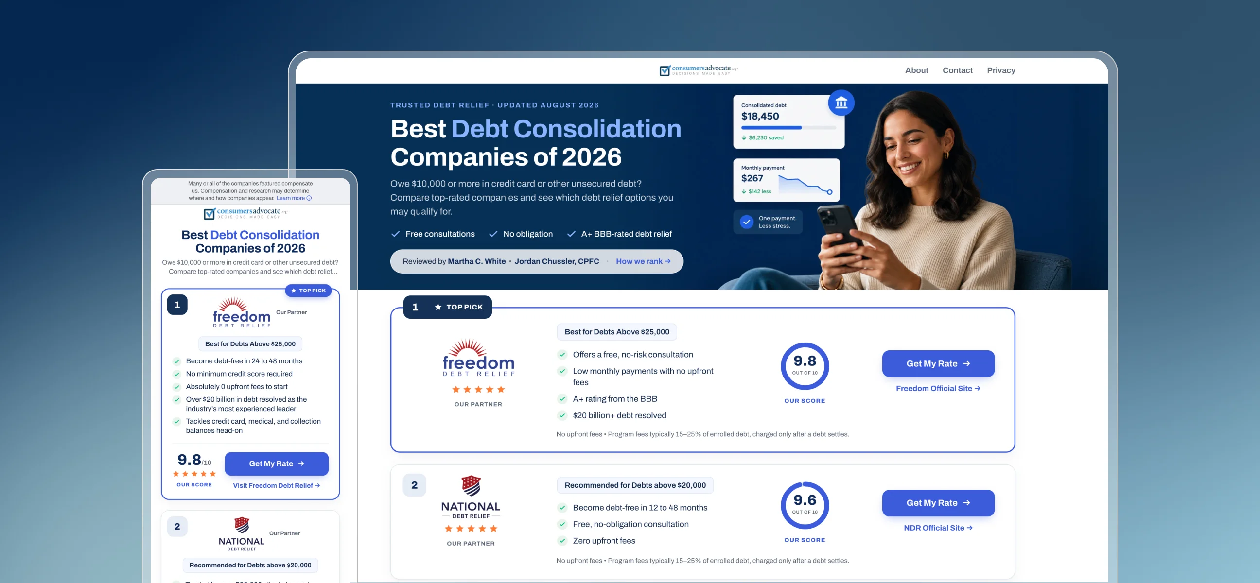
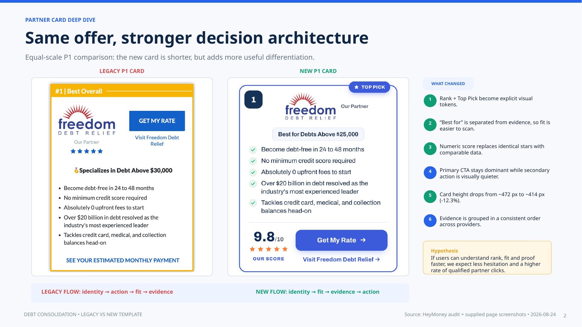
The partner card was reorganized from identity → action → fit → evidence into a clearer sequence: identity → fit → evidence → action. Explicit rank numbers and a Top Pick badge made recommendation order visible, while a dedicated Best For label helped users understand eligibility at a glance.
A differentiated numeric score replaced identical star-only ratings, evidence followed a consistent order across providers, and the secondary partner link became visually quieter. Even with the added decision support, the first card became approximately 12.3% shorter—from about 472 pixels to 414 pixels.
One Responsive System, With Clear Guardrails
The redesign consolidated two separate landing pages into one responsive system. Shared card anatomy, scoring, eligibility language, CTAs, and disclosures created a more consistent experience while reducing QA overhead and the risk of content drift.
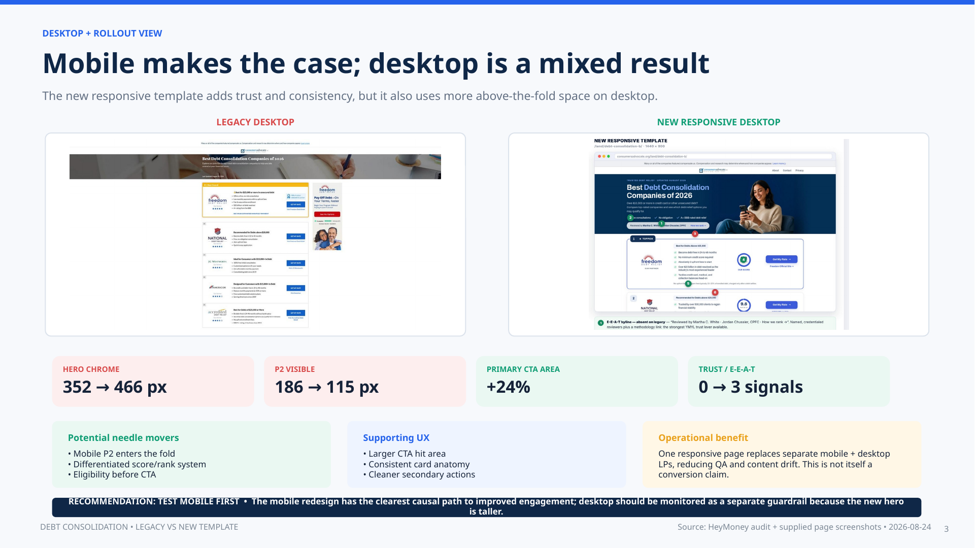
The analysis also surfaced an important tradeoff: desktop gained a 24% larger primary CTA area and three new trust signals, but the richer hero used more above-the-fold space. For that reason, the recommendation was to test mobile first and monitor desktop engagement as a separate guardrail rather than assuming one layout would perform identically everywhere.
Designing Trust Into the Page
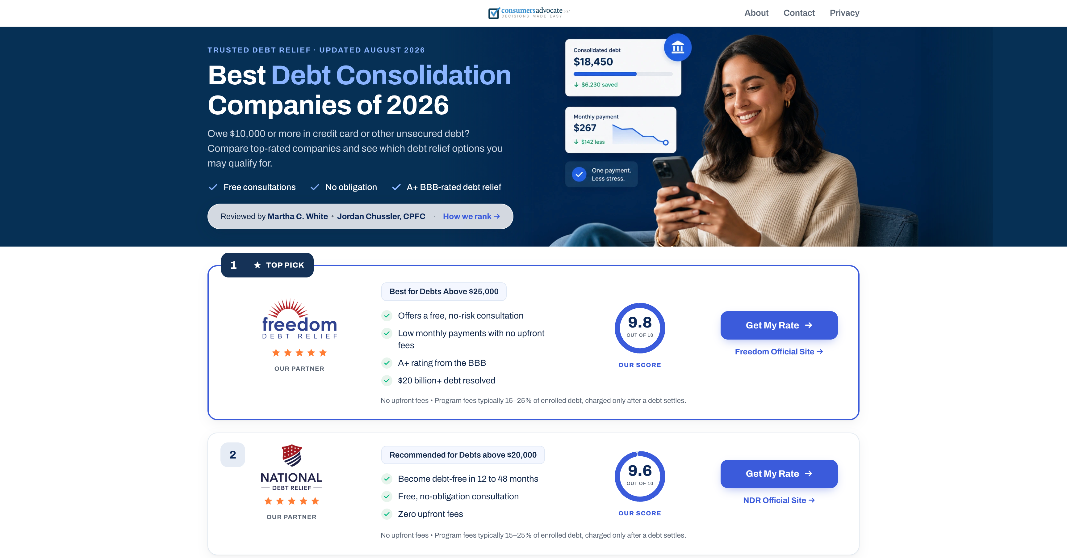
Debt relief is a high-consideration decision, so trust could not be treated as decoration. The new experience introduced visible expert review, a clearer How We Rank path, partner labeling, fee disclosures, eligibility language, and a consistent score system.
These elements helped visitors understand not only which provider ranked first, but why it was recommended and what conditions applied before selecting Get My Rate.
Mobile Execution
The mobile layout prioritized a fast, linear decision flow. Ranking, partner identity, Best For criteria, proof points, score, disclosure, and action remain visible in a predictable order, while the second provider enters the viewport early enough to communicate that the page offers a real comparison—not a single sponsored recommendation.
The Outcome
Post-launch performance moved in the intended direction. The redesigned experience met the team’s performance expectations, increasing partner click-through rate and improving ROAS by helping more visitors reach a relevant offer with the right context.
Exact commercial percentages are omitted, but the result supported the core product thesis: a denser, more transparent comparison experience can improve business performance without sacrificing user understanding or trust.